| Image |
Comment |
| 06/05/2006 02:30:53 AM |
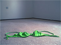
Abandonby tembaComment by kiwinick: ok good idea I would have cloned out the power point on the wall it sticks out 4 |
 Photographer found comment helpful. Photographer found comment helpful. |
| 06/05/2006 01:45:20 AM |
Abandonby tembaComment by shoelessaj: Right on!! Don't really know enough to give advice on the picture itself, but I do like the subject. |
| Photographer found comment helpful. |
| 06/05/2006 01:22:07 AM |
Abandonby tembaComment by amandalore: I would have photoshopped out the outlet, I like your composition and idea |
| Photographer found comment helpful. |
| 06/04/2006 06:38:11 PM |
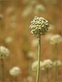
Success is: Keeping your head while all around are losing theirsby tembaComment by kari1: ::: Critique Club :::
Hi, my name is Kari and from the critique club.
First Impression - the most important one:
Great colours ... good DOF .. almost could be used as one of those inspirational posters they have in the workplace.
Composition:
the head of the seed is almost perfectly on thirds .. which technically is kinda cool.
Subject:
Without the title ... does this meet the challenge .. not sure .. but I think that this does on other levels really well.
Technical (Colour and light):
I love the colours you have captured so well.
To grow its vote?:
only take shots that meet the knowledge and understanding of success of the majority ... none of these left field/out of the box looks.
Summary:
I think you did great.... keep it up.
If you've got any questions about this critique, please feel free to contact me via
the PM system.
Cheers
Kari |
| Photographer found comment helpful. |
| 06/01/2006 11:31:40 PM |
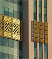
Turqouise and Gold Detailby tembaComment by KGregory: Great minimalist approach! The cropping really accenuates the architectural details. I love the shadows cast by the designs on the righthand side. The exposure looks good. My only advice is that the colors seem to have an overall warm cast - perhaps it could be cooled down. |
| Photographer found comment helpful. |
| 05/30/2006 12:37:13 PM |
Turqouise and Gold Detailby tembaComment by MeGoobie: I like that your subject shows contrast while connecting itself; the pattern is difference from the normal windows and yet they are both of the same shape and size. Crisp, clear... contrasting colors. I would have enhanced contrast more. |
| Photographer found comment helpful. |
| 05/30/2006 05:34:48 AM |
|
| Photographer found comment helpful. |
| 05/29/2006 04:55:28 PM |
|
| Photographer found comment helpful. |
| 05/29/2006 03:04:08 PM |
|
| Photographer found comment helpful. |
| 05/29/2006 04:34:54 AM |
|
| Photographer found comment helpful. |
Home -
Challenges -
Community -
League -
Photos -
Cameras -
Lenses -
Learn -
Help -
Terms of Use -
Privacy -
Top ^
DPChallenge, and website content and design, Copyright © 2001-2026 Challenging Technologies, LLC.
All digital photo copyrights belong to the photographers and may not be used without permission.
Current Server Time: 07/17/2026 07:28:44 AM EDT.