| Image |
Comment |
| 06/26/2006 08:59:21 PM |
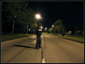
Alone In The Streetby LERtasticComment by pineapple: The suburbs are spooky places! City-mouse speaking here. This is a surreal image in a way. Is that the moon? I wish it was not quite so bright and wish the human was, say, on a bike with red tail light receding into the distance. Somehow, this had potential and needs a little help. |
 Photographer found comment helpful. Photographer found comment helpful. |
| 06/26/2006 09:50:10 AM |
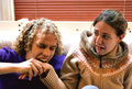
Human Fleshby LERtasticComment by skewsme: I loved the silliness and originality of this. Don't worry, you'll get the 5 minute editing drill down eventually ;-) I hope you'll use these models again in other challenges, they're terrific! |
| Photographer found comment helpful. |
| 06/26/2006 08:19:32 AM |
Alone In The Streetby LERtasticComment by redmoon: i ike the slightly surrealness of this picture; puts me in mind of "fight club" for some reason... i like that the subject is the blur, rather than the background, which i think is a creative take on the challenge. it feels wonky though, even though the horizon does look horizontal - i'm not sure what it is (camber in the road surface, illusion of the taller trees on the left?) but it is a distraction. as is the big street light right above your subject; i think you could have got round this by doing a more wide-screen type crop, like 10mm above and below your subject; not sure this would be 160px though... like it overall though, both conceptually and in execution. 7. |
| Photographer found comment helpful. |
| 06/25/2006 10:54:20 PM |
|
| Photographer found comment helpful. |
| 06/25/2006 02:53:59 PM |
|
| Photographer found comment helpful. |
| 06/25/2006 07:52:54 AM |
|
| Photographer found comment helpful. |
| 06/24/2006 01:38:25 PM |
|
| Photographer found comment helpful. |
| 06/23/2006 08:45:17 PM |
The Dunce Capby LERtasticComment by Ecce_Signum: Coming from my 1-4-0 thread ...
I can see why this is your (current) favourite shot Cyler, the bg is great but I must dissagree with the crisp focus comment below, yes, the wall is fantastic but for me Trevors hair is a little soft.
Both the challenge name and the title (for me) would be better depicted if Trevor was facing a corner as was mentioned during the challenge comments and maybe a wider angle.
|
| Photographer found comment helpful. |
| 06/23/2006 08:33:32 PM |
Human Fleshby LERtasticComment by Ecce_Signum: Coming from my 1-4-0 thread ...
Hi again, I'm inclined to turn the tables and ask you to comment on this shot! Don't do last minute entries, I've seen them ribbon but you and I don't get that lucky. Nice (though sordid) idea but the bg is messy and the focus doesn't seem sharp in the right places. Melissa might have nice knees but there is no reason to include one in this shot. |
| Photographer found comment helpful. |
| 06/23/2006 08:26:23 PM |
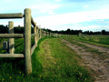
Leading to Nowhereby LERtasticComment by Ecce_Signum: comment from my 1-4-0 thread
Hi Cyler, This isn't a striking image for me though fits the challenge of green and does lead you nicely into (and out of) the image. You and others have mentioned the sky so I won't, however, the other bit that bothers me is that the front post is not as sharp as I'd have liked. Forget the challenge and maybe revisit the area with a better sky and clone out the pilon wires and those three sticky up things. |
| Photographer found comment helpful. |
Home -
Challenges -
Community -
League -
Photos -
Cameras -
Lenses -
Learn -
Help -
Terms of Use -
Privacy -
Top ^
DPChallenge, and website content and design, Copyright © 2001-2026 Challenging Technologies, LLC.
All digital photo copyrights belong to the photographers and may not be used without permission.
Current Server Time: 06/20/2026 07:24:14 PM EDT.