loveby
erainmanComment by CEJ: Hello from the Critique Club!
After studying your image I can say that I think the idea and execution of that idea are in conflict.
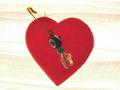
Composition/perspective - the heart is very centered in the image which takes away from the potential it has. Also it is very straight, as in the safety pin and beads are at a nice angle but the heart is just flat. A slight angle to the heart would help here as well as placintg the subject off to one side weighting the negative space. By flat I mean that the heart just seems to be lying/hanging there. Perhaps angling your camera to offset that would help - 80 degrees to the subject or so. This would give the heart some depth. The focus is off. Nothing seems to be the center of focus or attention of the camera. Again, the subject is just there.
Lighting - with no distinct reflections on the image it gives me the appearance that it is backlit. The background seems a little too bright. There are some streaks in the background as well. Not sure if the lighting caused this or post processing. But they do present some distraction. The edges of the heart also seem to flare a bit, again giving me the impression of backlighting (which is a good technique) but just a bit too bright.
Color - the red of the heart is a bit dark for this challenge. A softer pink may have worked better. In a different challenge this would be good - it is a nice rich color that is strong and could be used quite effectively. The white background is not all white. There are streaks of red and yellow across the image that should have been removed.
Challenge requirements - light on white is not an easy topic. It is very difficult under optimum conditions. However, here I think the red is just too strong. The beads and pin are ok since they are on top and the heart dominates the space. The background also takes away from conformance since it is not all white, but streaked as stated above.
Overall/my opinion - the concept you have here is a good one. I think it fails in the composition though. With slightly different lighting and a better focus this would be a stronger image. With slightly different coloring in the heart definitely would have helped. Your creativity shows with this image and I think you are demonstrating your potential. A little more work on composition and execution and you will have it down.