| Image |
Comment |
| 11/21/2005 01:45:50 PM |
|
| 11/20/2005 05:06:04 PM |
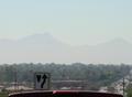
The Hidden Hillsby CamManComment by Ziurdt: A casual shot from the hip: what is the red rim at the bottom? Why the traffic sign? The composition is sloppy - this picture is clearly not taken for a photo challenge with the theme "camouflage". OK, the hills are nicely veiled, but somehow they remain nothing but a background - for nothing. |
| 11/19/2005 02:46:38 PM |
The Hidden Hillsby CamManComment by sestevens: Compositionally, I'd advise to crop the bottom of the photograph, because of it's prominence of the top of the vehicle, particularly in relation to the sign, your eye is naturally drawn to that instead of any camoflauged background. |
| 11/19/2005 12:10:13 AM |
|
| 11/18/2005 02:31:14 PM |
|
| 11/17/2005 12:52:54 PM |
The Hidden Hillsby CamManComment by talmy: Besides the fact that they aren't camouflaged, the bottom part of the picture is very distracting -- the roof of the pickup (I take it you are shooting from the bed?) and the road sign just don't belong. |
| 11/17/2005 12:19:55 PM |
The Hidden Hillsby CamManComment by Jammur: Artisticly not the most pleasing image, I don't like the dash in the frame, although the traffic sign is a good touch. As for meeting the challenge, its a tough call. I think it comes down to intent. The mountains did not generate the smog/haze themselves for the purpose of hiding, but then if the mountains weren't there the haze might have blown away...... Lawdy! Have a 6 |
| 11/17/2005 03:51:44 AM |
The Hidden Hillsby CamManComment by KiwiShotz: Interesting scene. Youve maybe left too much of the foreground to get the best of what you have here. You certainly needed to loose the car spoiler and I'm not sure if loosing the sign would throw the focus out into the hills area for more impact. |
| 11/16/2005 12:22:32 PM |
The Hidden Hillsby CamManComment by katswig: I would like it better without the truck roof in the foreground. I haven't decided yet about the traffic sign. |
| 11/16/2005 01:03:38 AM |
The Hidden Hillsby CamManComment by funnylooks: This image is a great concept, I like the creativity in not choosing the typical 'camoflauge' items. However I think that the image would greatly improve if the sign and the ?dashboard top? were not in it; they are much clearer than anything else in the image and it's distracting. |
Home -
Challenges -
Community -
League -
Photos -
Cameras -
Lenses -
Learn -
Help -
Terms of Use -
Privacy -
Top ^
DPChallenge, and website content and design, Copyright © 2001-2026 Challenging Technologies, LLC.
All digital photo copyrights belong to the photographers and may not be used without permission.
Current Server Time: 07/16/2026 02:22:41 PM EDT.