| Image |
Comment |
| 11/03/2005 12:23:49 PM |
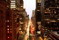
Bustling Park Avenueby dmmontyComment by ursula: Good entry for "busy". IMO, this particular take would need to be very sharp to be totally effective, and it isn't. Also, it would be nice if the sky were not so light. Lastly, I am wondering if you tried a vertical (more street less building at the sides)? (7) |
 Photographer found comment helpful. Photographer found comment helpful. |
| 11/02/2005 02:53:46 PM |
|
| Photographer found comment helpful. |
| 11/02/2005 02:31:00 PM |
Bustling Park Avenueby dmmontyComment by catn: Nice picture...However, because this picture has a lot of symmetry... Just rotating a bit towards the left would have tied with all the lines. |
| Photographer found comment helpful. |
| 11/02/2005 12:15:04 PM |
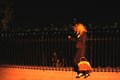
Clear indulgenceby dmmontyComment by Mr_Pants: I think that the lighting and background are well done, although the more I look at this, the more I wish that the glass were in sharper focus. Probably very difficult to achieve, though. |
| Photographer found comment helpful. |
| 11/01/2005 05:19:34 PM |
|
| Photographer found comment helpful. |
| 10/31/2005 08:05:30 PM |
Clear indulgenceby dmmontyComment by DrAchoo: The good: Nice idea and the coloring works with the subject
To work on: The glass' focus or position causes a weird shape which is distracting. Lighting a glass from the front is always a challenge in this type of photography. |
| Photographer found comment helpful. |
| 10/31/2005 07:49:10 PM |
|
| Photographer found comment helpful. |
| 10/31/2005 11:04:12 AM |
Clear indulgenceby dmmontyComment by funnylooks: I like porto, and the distorted bottle is really clear and has an interesting shape, but perhaps a colour other than orange/yellow could have been chosen for the backgroud? It's so bold, it almost overpowers.
nitpick: way off to the left by the border there seems to be a little extra line (missed when cloning out??) |
| Photographer found comment helpful. |
| 10/31/2005 08:00:30 AM |
Clear indulgenceby dmmontyComment by Tammer: A good idea. I like how the bottle looks through the glass. For me, I would have cropped this closer to your subjects though. Both objects are vertical, but your frame is a horizontal. To me, that makes it look kind of..."squished" - whereas changing this to portrait (or vertical) would enhance. |
| Photographer found comment helpful. |
| 10/30/2005 10:52:35 PM |
|
| Photographer found comment helpful. |
Home -
Challenges -
Community -
League -
Photos -
Cameras -
Lenses -
Learn -
Help -
Terms of Use -
Privacy -
Top ^
DPChallenge, and website content and design, Copyright © 2001-2026 Challenging Technologies, LLC.
All digital photo copyrights belong to the photographers and may not be used without permission.
Current Server Time: 07/15/2026 05:30:25 PM EDT.