| Image |
Comment |
| 06/11/2003 06:40:43 PM |
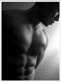
Male Fitnessby imagesloyolaComment by jmsetzler: great work... the lighting highlights the body definition very well here... the softness of the shot is excellent and it also makes a breat black and white. This is definitely one of my favorite shots this week... = 10 |
 Photographer found comment helpful. Photographer found comment helpful. |
| 06/11/2003 05:54:51 PM |
|
| Photographer found comment helpful. |
| 06/11/2003 01:04:20 PM |
Male Fitnessby imagesloyolaComment by moodville: Yum! The shadows really enhance the six-pack and the choice of black and white helps with the mood. Having the face not be the main focus works, especially as the magazine is promoting health and fitness. There is enough space around the image for the magainze blurbs and I could really see this on the front cover on Men's Fitness. The only negative is the over exposed area to the side of his shoulder. |
| Photographer found comment helpful. |
| 06/11/2003 01:00:05 PM |
|
| Photographer found comment helpful. |
| 06/11/2003 12:59:52 PM |
Male Fitnessby imagesloyolaComment by InnaN: Nice work! I like the lighting a lot, it really accentuates the shadows on the body. The background pattern on the wall seems a bit distracting however, a smooth backdrop and/or a shorter dof would have been better. 8 |
| Photographer found comment helpful. |
| 06/11/2003 11:51:38 AM |
|
| 06/11/2003 08:17:26 AM |
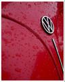
red wet volksby imagesloyolaComment by Fiver:
DPChallenge user Fiver has sent you the following private message:
Hello Edwin,
I see that you messaged me twice, but you never mentioned which Photo is yours. I think I know. The VW one... Let me know if I have the wrong photo.
Anywanys, I never said I thought your photo was of water. I was just saying that you will probably get a low score because it looks like water. It does look like water.
I didn't mark you down because of that. It rains a lot here, where I am. This just looks like an everyday photo of a wet car. The drops of 'oil' aren't interesting, the reflection on the hood isn't particulary interesting. It's not a very nice day. The only thing that draws my attention is the emblem and the line leading up to, and the two away from it. The lines in this shot are nice. There is 'liquid' in this shot, but it is not very interesting liquid.
As for the boarder in this one. You have a shadow on the left side, and a shadow on the right side. How can there be two apposing shadows? Where is the 'light' coming from? Well I know it is possible, but it doesn't look natural. So to be more precise, too much shadow on this boarder.
Again if I am looking at the wrong Photo let me know. That's just the way I see it.
Fiver
|
| 06/11/2003 03:18:23 AM |
Male Fitnessby imagesloyolaComment by briphoto: Very good model. I can't say I like the composition, I don't see enough of him. The lighting, especially the glare on the wall is not very good. Focus seems good, and I think it was a good choice to go b&w. |
| Photographer found comment helpful. |
| 06/11/2003 03:11:01 AM |
|
| Photographer found comment helpful. |
| 06/11/2003 02:41:22 AM |
|
| Photographer found comment helpful. |
Home -
Challenges -
Community -
League -
Photos -
Cameras -
Lenses -
Learn -
Help -
Terms of Use -
Privacy -
Top ^
DPChallenge, and website content and design, Copyright © 2001-2026 Challenging Technologies, LLC.
All digital photo copyrights belong to the photographers and may not be used without permission.
Current Server Time: 07/17/2026 02:52:46 AM EDT.