| Image |
Comment |
| 01/12/2006 08:56:16 PM |
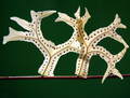
leafby CONRADComment by adine: very cool subject. nice light and focus. i would not crop so close leave some more of that great green surrounding the leaf - it feels a bit cramped this way. |
| 01/12/2006 05:03:28 PM |
leafby CONRADComment by ecto: Cool leaves! It looks like a bird and a dog facing each other. |
| 01/12/2006 04:47:56 PM |
|
| 01/11/2006 07:15:23 PM |
|
| 01/11/2006 06:56:18 PM |
leafby CONRADComment by pix-are: Great picture but this has nothing to do with Backlight!!! 3 |
| 01/11/2006 11:00:01 AM |
|
| 01/11/2006 04:45:17 AM |
|
| 01/09/2006 04:03:22 PM |
|
| 01/07/2006 08:02:32 PM |
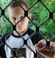
THROUGH THE SCREEN DOOR.by CONRADComment by jmsetzler: Greetings from the Critique Club...
This photo has excellent pattern and texture qualities, but the overall subject choice is probably too weak to generate much appreciation in a competition. Compositionally, there is room for some improvement. Since this is a setup photo, there are a couple things you may have done to improve the overall impact. I would have tried to position his eyes squarely in the center of one of the openings. This photo is also a good candidate for a black and white. The color isn't really creating any significant impact, and removing it would force the viewer to spend more time considering the texture and patterns within the image :)
John Setzler
|
| 01/07/2006 11:24:44 AM |
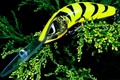
shape of a lureby CONRADComment by lindes: I would like this better, I think, with just a tad more space on each side -- especially the left. (Top and bottom are probably OK, but even there I might give a little more space.) |
Home -
Challenges -
Community -
League -
Photos -
Cameras -
Lenses -
Learn -
Help -
Terms of Use -
Privacy -
Top ^
DPChallenge, and website content and design, Copyright © 2001-2026 Challenging Technologies, LLC.
All digital photo copyrights belong to the photographers and may not be used without permission.
Current Server Time: 07/15/2026 06:58:09 PM EDT.