| Image |
Comment |
| 09/19/2005 07:54:01 PM |
|
 Photographer found comment helpful. Photographer found comment helpful. |
| 09/19/2005 03:45:03 PM |
Shh...Don't Tellby ElaineComment by Faye Pekas: The idea is good but the photo isn't really interesting. It is too scattered. Maybe a darker room with just a little light like a flashlight beam on the top secret card would have worked better. Good luck |
| Photographer found comment helpful. |
| 09/18/2005 11:17:07 PM |
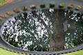
Bird Bathby ElaineComment by Neuferland: Greetings from the Critique Club!
And welcome! I see you just started here! I think and hope you will find lots of great information and ideas here.
Now, on to the critique of your entry. I like the idea you came up with, the reflection in the birdbath is very unique and good! But what could make it better is your next question I'm sure. Well, I'm no expert but I can tell you what I see and what I would change.
First the grass around the edges is very distracting and pulls away from the main subject of the shot, the branch on the tree. I think you could have cropped the top and bottom edges so you only had the edge of the bird bath left. Leaving it there actually gives me a bit of vertigo because it looks like you flipped your shot upside down and I can't look at it for very long because of the illusion you created. While this can be cool for some shots, the main subject isn't bold and interesting enough to make me want to keep looking at it and coming back to it.
The lighting seems a bit flat as do the colors, maybe a slight levels or curves adjustment would help there. It would help bring up the colors as well to really help make this shot stand out. That adjustment with just a slight cropping to leave the feeling of vertigo could really make this shot one that people have to keep coming back to just to make sure they saw what they think they saw.
Hope my comments help and again, WELCOME to DPChallenge!
Deannda |
| Photographer found comment helpful. |
| 09/18/2005 08:38:28 PM |
Shh...Don't Tellby ElaineComment by Tammer: For me, if the folder had a more authentic look (something printed off a computer) rather than hand written, it would work better. Also, maybe a list on the paper with one or two lines crossed off. Good idea though. |
| Photographer found comment helpful. |
| 09/18/2005 10:47:26 AM |
Shh...Don't Tellby ElaineComment by bfox2: I'd kindof like to see something on the computer screen like a little DOS prompt or something. The shot also looks a little bit flat, I think it would really benifit from a boost in contrast. |
| Photographer found comment helpful. |
| 09/18/2005 05:50:19 AM |
|
| Photographer found comment helpful. |
| 09/15/2005 07:13:37 PM |
Ivoriesby ElaineComment by amyrh: I love this photo. Black and white effect is good and great perspective. |
| Photographer found comment helpful. |
| 09/14/2005 08:29:03 PM |
Ivoriesby ElaineComment by kena: Nice picture, I like the perspective too. I don't think you really need to improve anything. |
| Photographer found comment helpful. |
| 09/12/2005 07:46:47 PM |
|
| Photographer found comment helpful. |
| 09/11/2005 10:27:31 AM |
Bird Bathby ElaineComment by eschelar: I'm sure everyone will say the same thing about the crop here. The focus on reflection shots is tricky. I got some fun ones myself when my mother picked some inky cap mushrooms and didn't use them before they melted to ink.
Your focus in the reflection is good enough to make out detail in the trunk of the tree and in the wood of the birdhouse... A bit too much is left of the background in the top left corner and because of the odd focal length used, it is in focus and is distracting.
Nice concept though. |
| Photographer found comment helpful. |
Home -
Challenges -
Community -
League -
Photos -
Cameras -
Lenses -
Learn -
Help -
Terms of Use -
Privacy -
Top ^
DPChallenge, and website content and design, Copyright © 2001-2026 Challenging Technologies, LLC.
All digital photo copyrights belong to the photographers and may not be used without permission.
Current Server Time: 06/21/2026 11:54:59 AM EDT.