| Image |
Comment |
| 02/20/2003 12:29:18 PM |
Path to heavenby bmarquezComment by bil99: Photoshop could have so dramatically improved this photo on so many levels. Overall it's very soft, and the color saturation and exposure just seem to be off. PM me if you're interested in seeing the improvements that could be made to it. |
 Photographer found comment helpful. Photographer found comment helpful. |
| 02/18/2003 10:21:39 AM |
Path to heavenby bmarquezComment by Amiee: Very creative .. .and i like the concept as well. The photo is very clear and the lightening is also very nice for the image. Good job. |
| Photographer found comment helpful. |
| 02/18/2003 01:16:12 AM |
|
| 02/17/2003 11:41:01 PM |
Path to heavenby bmarquezComment by 3boyzMom: Really interesting image. This was really refreshing after looking at all the lemon and flower shots! Thanks!!! More focus is all this needs to be a real winner! Maybe a little less sky at the top? |
| Photographer found comment helpful. |
| 02/17/2003 02:36:32 AM |
|
| 02/09/2003 02:01:39 AM |
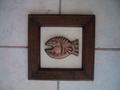
Squariumby bmarquezComment by indigo997: with a little help from annida:
I like the idea of this picture very much. The subject is appealing, and definitely fits the challenge of square. What I think you could have done to improve the composition was to a) either put a fabric behind the frame, so it's not on the tile, or b) cropped the picture so that it was actually around the frame, which would result with a square photo as well. I think a bit more lighting on the subject would have been good as well. Maybe you could have tried a duotone, since the colouring is almost there already, and made the contrast more, with some sharpening and use of curves. I think this is a very good attempt, and I hope to see more from you in the future! |
| 02/02/2003 01:28:51 PM |
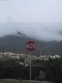
ALTOby bmarquezComment by jmsetzler: Greetings from the Critique Club :)
I think this photo could be much stronger. My primary problem with this image is that the colors are flat. There is not much of interest above the sign either. Maybe a tighter crop that cuts out most of the sky and wires above the sign would improve the overall image. Once that has been done, you will be dealing with the clutter behind the sign. The buildings and the wires directly behind the sign are still going to create distraction for the viewer in this photo.
Compositionally, I believe that the dead centering of the sign doesn't really offer a strong image. I believe that making the sign a much larger part of the image would have created more impact with this photo.
John Setzler
|
| 02/02/2003 08:28:11 AM |
Squariumby bmarquezComment by Jacko: lol, that's a funny lookin' fish. Cute shot. the light seem pretty dark, you might to brighten it up in Photoshop/Päintshop Pro. Good luck. |
| 02/02/2003 12:18:04 AM |
|
| 02/01/2003 12:58:09 PM |
|
Home -
Challenges -
Community -
League -
Photos -
Cameras -
Lenses -
Learn -
Help -
Terms of Use -
Privacy -
Top ^
DPChallenge, and website content and design, Copyright © 2001-2026 Challenging Technologies, LLC.
All digital photo copyrights belong to the photographers and may not be used without permission.
Current Server Time: 07/16/2026 11:36:07 AM EDT.