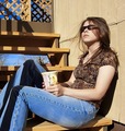
DPChallenge: A Digital Photography Contest You are not logged in. (log in or register
 
Browse Settings
Currently viewing:
Registered UserKivet

Show comments:

Per page:

Order:

Comments:


Comments Received by Kivet
Pages:   ... [92] [93] [94] [95] [96] [97] [98] ... [133]
Showing 941 - 950 of ~1321
Image Comment
Drinking in the Sun
03/06/2006 07:17:18 AM
Drinking in the Sun
by Kivet

Comment by chugginrail:
a very well composed picture... blue sky peeping through which blends with the blue jeans
Photographer found comment helpful.
Touched by the Wind
03/06/2006 06:56:46 AM
Touched by the Wind
by Kivet

Comment by IceRock:
To dark picture
Photographer found comment helpful.
Touched by the Wind
03/06/2006 01:08:32 AM
Touched by the Wind
by Kivet

Comment by Jutilda:
Beautiful title. Simple but I like the dark background. Nice.
Photographer found comment helpful.
Touched by the Wind
03/06/2006 12:50:47 AM
Touched by the Wind
by Kivet

Comment by hotpasta:
great colours against the black
Photographer found comment helpful.
Drinking in the Sun
03/05/2006 11:58:00 AM
Drinking in the Sun
by Kivet

Comment by Nyck:
love the hair swaying in the breeze
Photographer found comment helpful.
Drinking in the Sun
03/05/2006 01:13:08 AM
Drinking in the Sun
by Kivet

Comment by Commando303:
Mildly creative; technically, superb...perfect.
Photographer found comment helpful.
Drinking in the Sun
03/02/2006 10:23:01 PM
Drinking in the Sun
by Kivet

Comment by KiwiShotz:
Strong concept, perhaps photographically weaker. There's a number of elements all competing for attenttion and each weakens the overall impact. he shadows on the legs really detract from the impact and perhaps without them the trellis wouldn't matter.
Photographer found comment helpful.
Blue
03/02/2006 03:46:41 PM
Blue
by Kivet

Comment by DrAchoo:
Hey kivet, let's see. I didn't comment on this one during the challenge, but I could have easily castigated you for not ironing your sheet. Faux pas! Those creases just sceam "amateur" even if you aren't one. I know it's a pain to iron, but you gotta do what you gotta do. I gave this a 6, which I think represents a solid picture. I just commented on the last picture that I can easily see the difference between a 5.2 and a 4.8. It holds here. I think the high key works, but I'm not positive about the high contrast. It tends to make people look harsh. Composition is nice in that it isn't centered. I think it's actually a nice touch that the head is cut off, but I bet lots of people would like to point that out as a no-no. The pose is natural, and that's a good thing. Overall I think you showed a strong work. The contrast and the wrinkles probably brought you down the most.
Photographer found comment helpful.
Property Lines
03/02/2006 02:06:17 PM
Property Lines
by Kivet

Comment by Jutilda:
Nice deep blue tones. I'd straighten the horizon, as it's just a tad tilted to the right (or maybe it's an optical illusion I can't tell). Great leading line with the fence. I love your title.
Photographer found comment helpful.
Blue
03/01/2006 12:21:05 PM
Blue
by Kivet

Comment by anthonytuck:
Hi Kivet - I saw your note in Dr. Achoo's forum and thought I'd leave you a note. First of all, I have not entered many challeneges, so I'm no expert, but I do think that there is a certain kind of image that does well among voters. That isn't to say that those are necessarily good pictures, but it seems that images that are crisply in focus, with richly saturated colors and relatively high contrast seem to perform better among voters. I really like your photograph, but I suspect that people found the colors in the lower portion of the frame a little washed out. Since most voters don't spend more than a few seconds with each image, anything that they can latch onto to justify a vote, they'll take.

However, there also appear to be some people who are jerks (check out some of my scores and comments if you don't believe me). You can't avoid that, but still 43 people gave you a 3 or below. All I can say is they were wrong. The picture is better than that. I don't know - maybe they were people who also entered the challenge and were trying to hurt other scores. Who knows - but regardless, the photograph is better than their subjective opinions of it.

Ultimately (and I know this sounds like a cliche) it is more important that you like what you've done while remaining committed to improving and pushing yourself. You should check out another member - senoj. Her user ID is 43360. She seems to come in last or near last in virtually every challenge she enters but doesn't seem to really care. But what I find really interesting is that her work stands out. She is one of the few photographers (on the opposite side of the voting spectrum would be someone like Joey Lawerence) who's photos are immediately identifiable. She has a style and she seems to want to develop within it rather than copy someone else's style just to get closer to a little icon of a ribbon.

So, for what it is worth, I like your picture. Just because 43 people appear to vehemently disagree with me doesn't mean I'm wrong. But, that said, if you want to score higher on these things, use a tight focus, saturate colors but don't oversaturate them, elevate the contrast but don't overdo it and take a lot of pictures of birds flying around, mountains and lakes and flowers. You'll have a string of ribbons in no time.

Good luck with this.

Tony Tuck
Photographer found comment helpful.
Pages:   ... [92] [93] [94] [95] [96] [97] [98] ... [133]
Showing 941 - 950 of ~1321


Home - Challenges - Community - League - Photos - Cameras - Lenses - Learn - Help - Terms of Use - Privacy - Top ^
DPChallenge, and website content and design, Copyright © 2001-2025 Challenging Technologies, LLC.
All digital photo copyrights belong to the photographers and may not be used without permission.
Current Server Time: 09/11/2025 03:52:54 PM EDT.