| Image |
Comment |
| 05/14/2007 03:05:41 AM |
|
 Photographer found comment helpful. Photographer found comment helpful. |
| 05/14/2007 01:27:31 AM |
|
| Photographer found comment helpful. |
| 05/14/2007 12:41:12 AM |
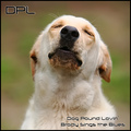
Dog Pound Lovin'by jeroweComment by Jutilda: OH GOD - I have to love this. That dog. The DOF and bokeh, not to mention the name. That is just a hoot. |
| Photographer found comment helpful. |
| 05/13/2007 11:09:41 PM |
Shadows of Moonlightby jeroweComment by timfythetoo: Greetings from the Critique Club -
Nice image and a nice score to boot. You easily met the challenge here. Symmetry caught well. The shadows on the dock really dont bother me at all. I think they are a nice touch and are not distracting at all. You may have had a stronger image without them, but they dont bother me personally.
Nice colors, cool gradient in the sky, the light is good. You did real well with the 30 second exposure. It would have been nice if your foreground was even on the sides, but its not the main focal point of the image so voters let you slide there.
6.4 is nothign to sneeze at. And no votes under 4 as well - that in itself is an accomplishment. You have some really nice work in your portfolio. Keep up the good work and I look forward to seeing your future entries!
Tim |
| 05/11/2007 08:44:11 PM |
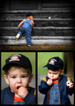
Childhood Easter Surprisesby jeroweComment by lkn4truth: CRITIQUE CLUB COMMENT
First impression was "Oh no! Not children!!" After I got past the initial horror, I realized that this was actually done very well. Your arrangement of photos is nice and I particularly love the top pane of the tripytch. Nice vignetting at the edges and I love the pose and composition on this one. The child in the lower third, the ball in the upper third really makes a strong composition in my opinion. A solid stand alone by itself. The lower left photo seems a little soft to me, particularly around the eyes which is the center focus for a portrait shot. Maybe that's my imagination because after I said this and looked closer the focus looks ok. Strange. The biggest problem I have with the whole collection though is the lower left because he seems to be putting food in his mouth and I just personally detest photos of children putting things in their mouths or having food in her face. Probably just a personal issue I need to work through. Anyway, the lower right photo seems a HAIR over exposed on the cheek. I like the ball in this photo to tie in more with the ball in the top pane. Unfortunately I didn't notice the ball in the lower right at first..only saw it after examining closeley for this critique. That's probably because again my eyes are drawn to whatever it is he's putting in his mouth. Had the childs focus been on the ball and not the food it would have been perfect. The color and contrast are good in all the shots but I'm not sure I'm fond of the vibrant green. It seems out of place somehow. Overall this is a VERY solid entry that you should be proud of. I'm sure your friend is going to want a print of this for his wall. Your score is about where I'd expect it to be...right around a 6 but not more. It has a LOT of promise but a few distractions keeps it from being a top 10 contender. All in all a fantastic shot. Crongrats! |
| Photographer found comment helpful. |
| 05/07/2007 06:22:39 PM |
Childhood Easter Surprisesby jeroweComment by Ann: Three good shots, that work together nicely. The lower left shot is the strongest of the bunch, it really captures the kid well. I'm not sure the vignetting on the top shot really adds much, especially since there's no vignetting on the others, but that's just my opinion. Nice job. |
| Photographer found comment helpful. |
| 05/07/2007 02:23:30 PM |
|
| Photographer found comment helpful. |
| 05/05/2007 05:35:35 PM |
|
| Photographer found comment helpful. |
| 05/04/2007 11:22:20 PM |
"Eyes Been Framed!!!"by jeroweComment by ericwoo: Hey there from the Critique Club
Camera Work/Technical: Nice, clean focusing and I like the idea of using this one as a black and white. Using a slight curves adjustment in your post-processing would have added some much needed contrast.
Lighting: The lighting is pretty nice in this capture. There is a bit of a hot-spot on the nose that loses some detail. A little bit less on the exposure would have helped it out.
Composition/Content: It is just a little too centered for a rule of thirds challenge. It is close, but I think a horizontal shot would have worked better, thus opening up that left side a bit.
My Opinion: Well, you pegged that score prediction, huh? I think that as it is, this one scored about where it should have. With some contrast adjustments and a little less centering, I think the score would have grown.
Thank you for the opportunity to provide a critique on your entry,
Eric |
| 05/04/2007 02:50:25 PM |
|
| Photographer found comment helpful. |
Home -
Challenges -
Community -
League -
Photos -
Cameras -
Lenses -
Learn -
Help -
Terms of Use -
Privacy -
Top ^
DPChallenge, and website content and design, Copyright © 2001-2026 Challenging Technologies, LLC.
All digital photo copyrights belong to the photographers and may not be used without permission.
Current Server Time: 07/23/2026 01:23:48 PM EDT.