Confinedby
jeroweComment by karmat: CRITIQUE CLUB CRITIQUE
by karmat
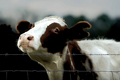
My initial response is that, "Boy, this cow is gonna get you!"
Compositionally, I'm not really fond of the straight on view of the cow or the straigth horizontal of the fence. Perhaps if it had been taken more no an angle, the perspective would have included some leading lines to add interest. However, taken as it is, the cow's head being in the left of the frame with the body leading to the left gives some "dynamicism" (I have no idea if that is even a word).
Technically, the sharpness of the nose and face of the cow, as well as the "richness" of the colors is really good. I like the "blurry" background as well. There is something about it that feels a bit too "dark" to me. Maybe it is the continuity between the cows darker colors and the darker background. I'm not sure it is something you could actually fix, but might be something to keep in mind, sometime.
In the minds of the dpc voter . .. .The fence wasn't as obvious as many were (you acknowledged this in your comments), BUT it is a fence and it is an important element of the picture. The comical expression of the cow probably allowed you to receive a higher score than if it were just a regular old cow standing there, so on that merit, great capture. I could see this being in one of "Farm and Ranch" or "Country Living" magazines' "caption this" contests. Great work.
If you have any comments or questions, please feel free to contact me.
karmat