| Image |
Comment |
| 02/24/2003 10:51:53 AM |
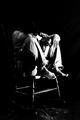
No Way Outby jitamsComment by Nebularus: Contrast is a bit too strong. I can't make out the head (well, barely). The concept is great! |
| 02/24/2003 10:36:46 AM |
No Way Outby jitamsComment by kebmod54: A little too dark for my taste. It has meaning when associated with the word "despair" . Thanks for sharing it. |
| 02/24/2003 01:09:46 AM |
|
| 02/24/2003 12:38:43 AM |
No Way Outby jitamsComment by Anachronite: I like the shot and the contrast, but could be a bit dimmer.. the birght part is just a little too bright |
| 02/23/2003 02:32:13 PM |
Vivaraby jitamsComment by Kavey: Feels like an old perfume advert from yesteryear. Nice golden light and strong composition.
7, Kavey |
| 02/22/2003 06:31:39 AM |
|
| 02/21/2003 11:17:16 PM |
Vivaraby jitamsComment by dsidwell: I like the lighting here, though I'd like a bit more contrast between the bottle and the background. |
| 02/21/2003 03:43:16 AM |
|
| 02/18/2003 12:59:41 AM |
|
| 02/17/2003 11:46:20 PM |
Vivaraby jitamsComment by Anachronite: i like the cap being out of focus here.. works well... playing with hue to get the color more yellow than gold would have been cool too... good lighting... |
Home -
Challenges -
Community -
League -
Photos -
Cameras -
Lenses -
Learn -
Help -
Terms of Use -
Privacy -
Top ^
DPChallenge, and website content and design, Copyright © 2001-2026 Challenging Technologies, LLC.
All digital photo copyrights belong to the photographers and may not be used without permission.
Current Server Time: 07/16/2026 06:10:45 AM EDT.