| Image |
Comment |
| 12/09/2002 09:03:58 AM |
|
| 12/09/2002 07:22:06 AM |
|
| 12/09/2002 04:08:26 AM |
|
| 12/09/2002 12:36:45 AM |
|
| 12/08/2002 11:18:42 PM |
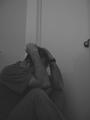
untitledby jab119Comment by Arachnophilia: nice composition, and dingy grays. the wall doesn't look straight to me. kinda like it's coming down over his head. which kind of works. 9 |
| 12/07/2002 07:00:11 PM |
untitledby jab119Comment by PTLParsons: Needs to be in better focus. Not light enough, Don't like the cropping. Crowded into the bottom left corner. PTL 4 |
| 12/07/2002 12:31:33 AM |
untitledby jab119Comment by muckpond: This does not have enough contrast -- the color (well, the grays) are all too similar to make this pop out. Also, I would try cropping out the doorknob if possible. It really distracts for some reason. muckpond |
| 12/06/2002 04:17:02 PM |
|
| 12/03/2002 11:52:00 PM |
|
| 12/02/2002 04:08:00 PM |
|
Home -
Challenges -
Community -
League -
Photos -
Cameras -
Lenses -
Learn -
Help -
Terms of Use -
Privacy -
Top ^
DPChallenge, and website content and design, Copyright © 2001-2026 Challenging Technologies, LLC.
All digital photo copyrights belong to the photographers and may not be used without permission.
Current Server Time: 07/16/2026 01:21:27 AM EDT.