| Image |
Comment |
| 02/10/2003 10:09:03 PM |
|
| 02/10/2003 06:54:22 PM |
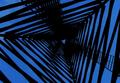
Triangles?by jab119Comment by Jacko: Very nice effect. I think it would be even more effective if one of the sides was parallel to the horizon. I love the tone of the sky. Jacko. |
 Photographer found comment helpful. Photographer found comment helpful. |
| 02/09/2003 10:36:40 PM |
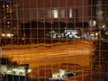
Office Windowsby jab119Comment by Annida: Hello from the Critique Club!
Composition:
Very good!
Actually, I'm going to drop all the formalities for this one. I Love it. I can't think of anything that you could have done better, or anything which is specifically wrong. The colour is a tiny bit dull cause of the night lights, but you can't do anything about that. Did you try a picture during the day? I bet you would have just gotten a load of glare on the glass, so it's just as well you took it at night.
Your score obviously reflects that nicely :) I'm glad you posted this pictured! good luck in the future; if this is any indication of your work, I wouldn't be surprised if you walk off with a ribbon soon! |
| 02/09/2003 07:23:53 PM |
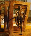
Jumping through squaresby jab119Comment by goodtempo: Critique Club Critique
Composition/Content: Interesting image. You've had some really good comments on how to improve this. The different sources of light create a background that is a different color than the foreground and that takes away from the impact of the image. Being a picture of someone else's artwork also takes away points. The camera angle hides the other figures jumping through the squares.
Camera Work/Technical: You've really done a good job with the focus, exposure, and the night shot.
My Opinion: I think that being mostly a picture of another's artwork, having a distracting background, and the main subject not really a square contributed to this image's final score in the challenge. Even so, I think it is a very interesting shot and would like to have seen it from the front of the figures. |
| 02/09/2003 05:47:00 PM |
|
| 02/08/2003 07:30:53 PM |
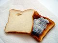
Bread and Toastby jab119Comment by PTLParsons: Don't you think that toast is a little over done. I would have scraped it before buttering it. In my opinion, if you were going to use the paper towel as the background that is all that should have been in the background. You should have cropped it as close on the other three sides as the bottom is. The cropping is ok if you had not used the paper towel and just put the toast on the white counter. Either way, not both. Other than that it is a reall good photo and right on for the challenge. |
| 02/08/2003 12:21:34 PM |
Bread and Toastby jab119Comment by lisae: I'm not sure that the kitchen paper works as a prop. It undermines the texture of the bread a bit. I think I would actually prefer the toast to be the top piece, because the plain piece of bread isn't as interesting to look at. |
| 02/06/2003 12:44:16 PM |
|
| 02/06/2003 10:34:08 AM |
|
| 02/05/2003 07:55:53 PM |
Just another Roseby jab119Comment by PTLParsons: Beautiful peach rose. Leave off the water. Tops as it is. The beauty is in the rose. Background should be totally black or real soft light color. This could be a beautiful piece of art. Well done. Really nice focus and cropping. Perfectly shaped rose in perfect condition. Nice one. The more I look the better I like this. Also decided the background should be solid the color of the botom right corner or soft light color. Had to up the score to a 10. |
| Photographer found comment helpful. |
Home -
Challenges -
Community -
League -
Photos -
Cameras -
Lenses -
Learn -
Help -
Terms of Use -
Privacy -
Top ^
DPChallenge, and website content and design, Copyright © 2001-2026 Challenging Technologies, LLC.
All digital photo copyrights belong to the photographers and may not be used without permission.
Current Server Time: 07/16/2026 03:41:03 PM EDT.