| Image |
Comment |
| 11/01/2006 01:40:31 PM |
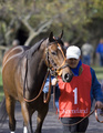
The walkerby farmer48Comment by RiderGal: Since you don't get all of the horse's legs anyway... I think you might have cropped tighter here for a more impactful image. Also looks a bit light to me. |
 Photographer found comment helpful. Photographer found comment helpful. |
| 11/01/2006 12:40:34 PM |
|
| 11/01/2006 12:28:05 PM |
|
| Photographer found comment helpful. |
| 11/01/2006 12:02:39 PM |
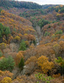
Red River Gorgeby farmer48Comment by eqsite: I'd love to see this during sunrise or sunset to get some nice shadows amongst the trees. Without that, it looks a little too flat. |
| 11/01/2006 09:40:48 AM |
Red River Gorgeby farmer48Comment by dallasdux: The saturation on the greens is good, but I would like a bit more vibrant colors in the yellows/oranges. They come off a little flat against the vivid greens. Score: 6. |
| 11/01/2006 05:18:31 AM |
Red River Gorgeby farmer48Comment by Falc: There is only a subtle composition in this image, nothing really striking. The colours are nice but not outstanding. It needs something more, but I'm not sure the subject really has that much potential |
| 02/25/2006 02:52:28 PM |
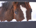
feeding timeby farmer48Comment by loseme: *Critique Club*
"Feeding time" is an great addition into the Country Life challenge. The image is so full it is bound to grab peoples attention. I think the shots biggest disadvantage is its size, unfortunately in this contest size does matter. I think a lot of people really do just lower their score based on if the size was to small.
The image itself is very interesting. I think using the fence as a frame works, you might try to make it a little more level. Also step away from the shot just a little, I understand that maybe if you stepped back another foot you might loose the tight boarder and end up with some empty space which I wouldn't recommend. It just seems like it needs a little more balance. The deep color of the horse is an excellent contrast between the snow and him/her. Good work. |
| 02/20/2006 12:27:10 AM |
|
| 02/19/2006 09:22:51 AM |
|
| 02/17/2006 05:41:40 AM |
feeding timeby farmer48Comment by elee3009: Like the way the fence has been composed to frame the horse. I would just crop the bottom out more to balance off with the top. The other thing that doesn't help is the size of this image which diminishes the impact of his eyes even though they seem to be the main subject here. Go to the DPC tutorial to learn how to resize for this site. |
Home -
Challenges -
Community -
League -
Photos -
Cameras -
Lenses -
Learn -
Help -
Terms of Use -
Privacy -
Top ^
DPChallenge, and website content and design, Copyright © 2001-2026 Challenging Technologies, LLC.
All digital photo copyrights belong to the photographers and may not be used without permission.
Current Server Time: 07/15/2026 12:46:39 PM EDT.