| Image |
Comment |
| 09/01/2006 11:08:00 AM |
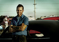
A Day at the Racesby ShermyComment by CNovack: As I gaze upon this photo I cannot help but think of the film American Graffiti . The somewhat muted colors give it a nostalgic feel - which helps because the composition has some old style classic cars in it. The title of this piece is A Day at the Races and unfortunately the composition of the elements just doesn't carry it off. You don't show us much of the cars in this shot - all we are given is the top portion. Showing us more of this racer leaning against the car with the front portion, the hood, the wheels visible. We see the racer but showing more of his car will give us a better sense of who he is and what action is about to take place. Next shooting at a lower angle and a different angle (perhaps to the side of the car where the grille and headlight are seen at a diagonal) would remove all the unsightly elements that detract from the main focus of your image ( the other cars, that guy strolling by in the background, the billboard, and possiblity the telephone poles & wires). |
 Photographer found comment helpful. Photographer found comment helpful. |
| 09/01/2006 11:03:03 AM |
|
| Photographer found comment helpful. |
| 09/01/2006 10:42:14 AM |
|
| Photographer found comment helpful. |
| 09/01/2006 09:45:44 AM |
A Day at the Racesby ShermyComment by Konador: Composition: 7 - Very nice, focuses attention well on the man. The large amount of black space on the bottom right is the only thing distracting.
Technical: 7 - Good DoF to separate him slightly from the background, but still leaving background detail to give him a context. The post processing effect is nice too
Creativity: 6 - More than just a normal portrait, shows more of his character, nice.
Appeal: 6 - Overall I like the "gritty" effect from the PP which suits the subject well :)
Overall Calculated Average Score: 6 |
| Photographer found comment helpful. |
| 09/01/2006 08:09:40 AM |
A Day at the Racesby ShermyComment by DemonLlama: At first glance I didn't like this photo because of the color tone but the more I look at it (and assume the tone is intentional), the more I get a nostalgic 1950s feel. Shame the wires are in the background as it distracts a little bit but this is nicely processed for effect. |
| Photographer found comment helpful. |
| 09/01/2006 07:56:14 AM |
A Day at the Racesby ShermyComment by docurrie: I like the feel I get from this picture, the only problem I have is the guy in the back ground somehow doesn't seem to fit in. good luck. |
| Photographer found comment helpful. |
| 09/01/2006 07:36:56 AM |
|
| Photographer found comment helpful. |
| 09/01/2006 12:01:21 AM |
A Day at the Racesby ShermyComment by ergo: Lots of haloing around the face and car, indicative of masking and d&b work. I generally like the composition and facial expression. |
| Photographer found comment helpful. |
| 08/31/2006 11:37:50 PM |
|
| Photographer found comment helpful. |
| 08/31/2006 11:07:08 PM |
|
| Photographer found comment helpful. |
Home -
Challenges -
Community -
League -
Photos -
Cameras -
Lenses -
Learn -
Help -
Terms of Use -
Privacy -
Top ^
DPChallenge, and website content and design, Copyright © 2001-2026 Challenging Technologies, LLC.
All digital photo copyrights belong to the photographers and may not be used without permission.
Current Server Time: 06/19/2026 03:47:55 PM EDT.