| Image |
Comment |
| 04/11/2006 10:14:29 PM |
|
 Photographer found comment helpful. Photographer found comment helpful. |
| 04/11/2006 09:09:42 PM |
|
| Photographer found comment helpful. |
| 04/11/2006 08:14:34 PM |
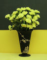
Still Life In Black and Yellowby olddjComment by thomaspeople: I really like the composition and layout here. The only thing I think you could have done better, post process, would be to apply neat image or something like it to the top background. The two color split, with contrasting top and bottom of the flowers and vase is excellent, but I'm distracted by the texture on top.
You also have a little wrinkle on the yellow bottom near the left side of the vase, and the color on bottom could have been brightened a little with more direct lighting.
I know, I know. You've seen my yellow entry, and who am I to say these things?! But I really do like your shot and only want to offer what I see and have tried to learn myself. |
| Photographer found comment helpful. |
| 04/11/2006 03:08:25 PM |
Still Life In Black and Yellowby olddjComment by olddj: That vase has been mentioned a couple of times, it is a Tiffin Glass Satin Finished black glass vase with Rockwell Sterling overlay. One of our favorite black glass pieces, we have over 100. Chose the satin finish as has almost no reflective problems, as most other glass does. Easy to use even a flash and get no bad spots with it!! Small tip that does work! LOL
Jacque |
| 04/11/2006 02:50:34 PM |
Still Life In Black and Yellowby olddjComment by JH: Most of what eschelar said below were also my thoughts on the technical aspects.
My only additional technical observation is that it would have been good to bring out the colours and contrast (especially the contrast) in post-processing. The lighting looks a bit flat, so post-processing would have made the contrast and tones more interesting.
While this is a nice 'classic' composition, it just lacks that extra something to hold my interest for very long. The most interesting part of the shot for me was the pattern on the vase. |
| Photographer found comment helpful. |
| 04/11/2006 08:14:47 AM |
Still Life In Black and Yellowby olddjComment by eschelar: I like the idea, but there are some serious fatal flaws that I see in this pic.
#1 Focus. I would personally have used a deeper DOF to get more flowers in focus as well as keeping all parts of that vase sharp. Nice decorative work on it.
#2 Depth of Frame. I think you could have greatly benefited by moving your whole setup about a half foot to a full foot farther away from the wall. This would have greatly helped in making the top part of the background Black as Black and would also put it in the defocused area. This might have helped if there was a problem with the actual graininess on the backdrop material.
#3 Backdrops. Ooof. To be honest, I prefer the softer yellow of the cloth at the bottom of the frame over the yellow paper. Would there have been a way to set up the yellow cloth in such a way that it 'bent' upwards as it went back to allow a totally fluid and seamless backdrop? You could then have used the black paper to create a nice flat line across the top. This would have been challenging as you would have needed to light the background. One idea would be to have a light stuck through the cloth and hidden behind the carnations. It would have had a nice, balanced effect. It still would have needed a bit of side lighting to give depth and definition to the carnations, but that would have been OK because the subject would have been moved away from the backdrop.. right?
#4 Blacks. I felt that the main idea of this picture was to allow the top of the black vase to meld seamlessly into the background when I first saw the thumbnail. Doesn't look like it worked out so well here.
If you got the lighting right and moved the flowers/vase forwards, you would likely have found that your actual Background was quite black already (keep that backlighting LOW). This would have made it easier to hit curves and meld away.
I really like the idea of a vase that looks like a drip from the blackness coming to form a glass object with flowers sticking out of it.
It was a great idea. |
| Photographer found comment helpful. |
| 04/11/2006 01:30:32 AM |
They REALLY Mean "No Swimming"!!by olddjComment by Rikki: This image unfortunately has hardly any appeal for the average DPC voter IMHO. Don't get me wrong but for a photo to score high, it needs to have "the look". This however, lacks it greatly. |
| Photographer found comment helpful. |
| 04/11/2006 01:28:50 AM |
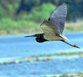
Wings Over Waterby olddjComment by Rikki: The bird capture is fantastic I agree. But this is advanced editing and I think the rest of the image could have benefited from a bit more saturation of the colors and a bit sharper bird. |
| Photographer found comment helpful. |
| 04/11/2006 01:27:22 AM |
Some playtimes are much simplier than others!!!by olddjComment by Rikki: IMHO, this didn't deserve the low score it received. However I can see why it received such a score. First of all, the sky is blwon out. Probably due to a level adjustment or it might be curves. Why can I tell? Look at the brush in the background, it is totally washed out. I think the curves got a little too carried away. As far as the subject is concerned, maybe a show of the face would have been better. It would be nice to see the expression on the face. Kinda like saying, "Hey I'm having fun and I'm loving it". |
| Photographer found comment helpful. |
| 04/11/2006 01:24:10 AM |
Still Life In Black and Yellowby olddjComment by Rikki: The idea here Jacque is a good one. However, there isn't enough punch in the image. The WB seems a tad off and a tighter crop would have served this image a lot better. |
| Photographer found comment helpful. |
Home -
Challenges -
Community -
League -
Photos -
Cameras -
Lenses -
Learn -
Help -
Terms of Use -
Privacy -
Top ^
DPChallenge, and website content and design, Copyright © 2001-2026 Challenging Technologies, LLC.
All digital photo copyrights belong to the photographers and may not be used without permission.
Current Server Time: 07/16/2026 11:57:05 AM EDT.