| Image |
Comment |
| 05/03/2006 12:46:29 AM |
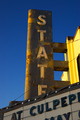
Meet You at the State!by livitupComment by crayon: This photo doesn't mean anything to me, in the sense that, I cant relate any meaning to the "state". Is it a cinema?
Technically, it's good, and the blue gradient looks nice. |
 Photographer found comment helpful. Photographer found comment helpful. |
| 05/02/2006 06:41:09 PM |
|
| Photographer found comment helpful. |
| 05/01/2006 03:57:38 PM |
|
| Photographer found comment helpful. |
| 05/01/2006 02:48:33 PM |
Meet You at the State!by livitupComment by glad2badad: I noticed last week, driving thru town, that they've really cleaned up the front of that building. I think it's that one anyway. Stopped and ate at Pancho Villa's while we were in town. ;^) I like the way the late day sun reflects off the State sign - nice composition the way you've framed this. Good luck in the challenge. |
| Photographer found comment helpful. |
| 05/01/2006 02:54:51 AM |
|
| Photographer found comment helpful. |
| 04/29/2006 05:05:33 AM |
Top Shelfby livitupComment by gloda: The framing and the POC view of this image are well chosen. You might have included all of the orange glass though, or cropped out some more. This creates a 'chopped off' impression. Also, your background is too busy because the text on the bottles is still readable. You would either have needed a far narrower DOF, or bottles with less prominent labels. |
| Photographer found comment helpful. |
| 04/29/2006 05:02:55 AM |
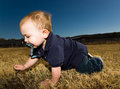
At Dominik's Levelby livitupComment by gloda: You did well in choosing a low point of view for this photograph. Taking chilren's pictures from an adult's perspective usually makes the look too small and may even distort them when you use too wide an angle.
I find your use of the flash quite interesting. I would usually not have used fill flash in such a situation (partly because it seems you were quite close), but I enjoy the final effect. It sets the child off from the background.
You are right about the face though, you might want to darken it a bit in post processing. |
| Photographer found comment helpful. |
| 04/26/2006 05:58:19 PM |
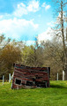
Just Can't Make Itby livitupComment by DrAchoo: A few things, although I like the picture and idea overall.
1) The composition is so centered. Boring. You know better than that.
2) The building is awesome, but is just a bit dark. We lose the great detail of all the wood planks.
3) I think you did a good job on the sky, but to be honest, the tone in the middle is my least favorite color of sky. It looks like faded slides to me. That's just a nitpick though. I think you did well with the sky.
It's mainly the centered composition which got you here, I think. |
| Photographer found comment helpful. |
| 04/25/2006 11:28:48 AM |
|
| Photographer found comment helpful. |
| 04/25/2006 09:51:23 AM |
|
| Photographer found comment helpful. |
Home -
Challenges -
Community -
League -
Photos -
Cameras -
Lenses -
Learn -
Help -
Terms of Use -
Privacy -
Top ^
DPChallenge, and website content and design, Copyright © 2001-2026 Challenging Technologies, LLC.
All digital photo copyrights belong to the photographers and may not be used without permission.
Current Server Time: 07/15/2026 09:49:29 PM EDT.