DPChallenge: A Digital Photography Contest You are not logged in. (log in or register
 
Browse Settings
Currently viewing:
Registered Userlivitup

Show comments:

Per page:

Order:

Comments:


Comments Received by livitup
Pages:   ... ...
Showing 151 - 160 of ~245
Image Comment
The Affair
12/11/2005 05:41:31 PM
The Affair
by livitup

Comment by jonr:
Nice colors.
Photographer found comment helpful.
The Affair
12/10/2005 08:28:46 PM
The Affair
by livitup

Comment by Pug-H:
Nice colours. I would have liked more shiny reflection on the blade of the knife.
Photographer found comment helpful.
A Five Minute Break
12/09/2005 07:34:01 PM
A Five Minute Break
by livitup

Comment by KiwiShotz:
::: Critique Club :::
This looks like a lot of fun

First Impression - the most important one:
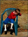
Melancholy, it looks sad. He looks like he's in the Naughty Chair. What does that mean for the photo? I'm engaged, no longer passive. There's a story here and I'm interested in exploring it. Good stuff.

Composition:
Composition "rules" are almost certainly misnamed as they are not rules at all but protocols in illustrative composition that have been found to have been attractive to viewers.

So you've had a number of suggestions about cropping and layout, some conflicting. The composition rules will help you find a balance that will negate those comments.

Subject:
He's lovely, so very typically kid. A newspaper pictures editor will always tell you to get them a picture with a child in it - they are appealing photographically. In this case, we have one who looks upset and that becomes the basis for wondering what is going on. We are engaged and that sure beats ambivalence when it comes to art and photography.

Technical (Colour and light):
To be fair, you didn't have any time or opportunity to do anything else but snap the shot because he was being a typical boy. The trouble with that is that it does look like a snapshot. Hopefully with some of the things discussed around here it will be easy to turn the snapshot opportunity into a great pic.

With you trying to get some light and drama into it, the saturation has gone artificially too strong. I wonder what effect a colour de-saturistaion might have done to the 'mood'. I wouldn't go as far as gratuitous B&W.

It might be a funny thing to say but the light is your enemy in this shot. Bright noonday sun gives you harsh shadows and because it is coming ovedirectly overhead at the subject, it just flattens everything. The shadow under the chair is quite distracting. Overcast days give you great even light and no shadows.

To get a Ribbon?:
Given that you didn't have control of the model :) or the light and just took the split-second opportunity, there's some things you can do that might make some difference. Big voting scores come from drama, shock, awe, humour etc but they're always dramatic. So, what to do? I am always uncomfortable saying do this or do that. It is the photographer who decides what the ultimate effect is going to be. However there are some general principles that could help.

Look for the drama that could be in this shot.
- Get your main point of interest onto a thirds intersection.
- Perhaps if you'd lowered your POV to his height, a lot of empty field may come into view to frame him. You would also be taking a kids eye perspective rather than looking down.
- From a lower point, try a zoom out to include a whole lot of 'neutral space' of empty fields around him. From that would come this wonderful feeling of poor little boy all alone and desolate.
- The chair in a wide open space would be out of place - in a good quirky way.
- since the midday sun isn't going to move, move the camera. Go left or right and get the sun at nearly 90deg to the subject. This makes for great highlights and contrasts and sometimes gives you a dramatic feel.

Summary:
The subject and the pose are so evocative and it's a good eye that sees that emotive aspect and has camera at the ready to capture it. On the same day at the same time you could have then added the painters eye by using some of the techniques above. Sometimes they work, sometimes not - but that's the pure pleasure and fun of photography.

Give him a hug from us ... :)

Brett

Message edited by author 2005-12-10 02:27:48.
Photographer found comment helpful.
My Golden Handcuffs
12/09/2005 04:53:39 PM
My Golden Handcuffs
by livitup

Comment by mffnqueen:
Greetings from the Critique Club!

Let's start with composition and focus. I agree with you that landscape is definitely more fitting for this image than a tradition image size would be. I really like the placement of the cufflinks. The semicircle is effective in hiding the back ends of the cufflinks, so much so that it took me several seconds to figure out what these were! I also like that they are slightly off center, with the colorful one appearing to be the center focus-wise. However, I don't like the order that they're placed in. Putting the two silver ones on the edge allows them to get blown out, fading into the white of the background. I would have preferred either seeing them moved towards the center or at least given an interesting reflection.

In terms of color, the colorful cufflink seems really out of place along with three metallic ones, especially since it is the largest and the one most in focus. That old song "One of these things is not like the other..." pops into my head viewing this photo. I personally would have minimized the emphasis on that one cufflink, or replaced it entirely with another metallic one.

I also have two small, nitpicky suggestions. First of all, the gold cufflink looks like it needs to be polished. The streaks take away from the professionalism of the photo, and I think a smoother link would have given the entire photo a much more polished feel. Second, the threads of the cloth you're using as your background are evident underneath some of the cufflinks, especially the colorful one, and that's really distracting. When you're using a macro lens, sometiems that can bring out detail in things you would rather not see, so be careful in that respect.

In regards to the challenge, I just don't think four of anything qualifies as a collection. In this particular challenge, I think it's quantity over quality, to an extent. If there were 20 cufflinks in this photo, it might have been more competitive, but I think that no matter how perfect this shot was, including only four things is going to keep it from really having the "wow" factor that wins challenges.
Photographer found comment helpful.
The Affair
12/08/2005 02:13:08 PM
The Affair
by livitup

Comment by Tammer:
...and the fork ran away with the spoon? :-) I like the lighting. Creative and clever. Nicely done.
Photographer found comment helpful.
The Affair
12/06/2005 11:47:56 PM
The Affair
by livitup

Comment by loseme:
Oh this is nice a wicked. I love the coloring red on the passion and purple on the sadness.
Photographer found comment helpful.
My Golden Handcuffs
12/06/2005 09:10:33 PM
My Golden Handcuffs
by livitup

Comment by tpoc:
lol! some great cuffs. i want to say that the white background is reflecting on the cuffs, making the image appear to be pretty bright in spots..
Photographer found comment helpful.
The Affair
12/06/2005 09:04:03 PM
The Affair
by livitup

Comment by Keith Maniac:
Poor Mr. Knife....
Photographer found comment helpful.
The Affair
12/06/2005 02:52:21 AM
The Affair
by livitup

Comment by tonyv:
The affair ... or The Voyeur? The knif, fork and spoon need a little more definition; they seem very flat and not-shiny.
Photographer found comment helpful.
The Affair
12/06/2005 12:13:43 AM
The Affair
by livitup

Comment by echo54:
neat
Photographer found comment helpful.
Pages:   ... ...
Showing 151 - 160 of ~245


Home - Challenges - Community - League - Photos - Cameras - Lenses - Learn - Help - Terms of Use - Privacy - Top ^
DPChallenge, and website content and design, Copyright © 2001-2025 Challenging Technologies, LLC.
All digital photo copyrights belong to the photographers and may not be used without permission.
Current Server Time: 08/01/2025 09:58:09 PM EDT.