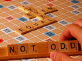
Not Oddby
wavelengthComment by HBunch: *Critique Club*
Without photographer's comments, I'm not really sure what you were trying to achieve here, so my advice will be based on my own personal opinion.
The first thing I notice here is the over orangish hand. Looks like maybe some lowish lighting, which you might have needed to keep reflections off the shiny board. However, the skin tones look unnatural and it's a bit of a distraction.
I like the concept, maybe just a bit TOO set up, but otherwise a neat idea for the challenge. There are a lot of 'Odds' in this pic as well. 3 fingers, triple words scores, the word odd, the very many 1's in the photo. So really, it COULD have been used for either challenge, but probably more fitting here since the words are based on being even.
Lighting seems a little dull. Would like to see the colors punch a bit more, and would like to see the lighting on the hand be a bit different, maybe softer.
Focus and clarity are really good. Nothing distracting there. The background (board) is quite appropriate. Really, my only complaint is the hand and lighting.
Otherwise, nice shot. ~Heather~