| Image |
Comment |
| 03/02/2006 08:09:43 PM |
|
 Photographer found comment helpful. Photographer found comment helpful. |
| 03/02/2006 03:00:21 PM |
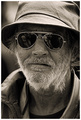
Invisible for everyoneby patrinusComment by Jutilda: Nice portrait. The details of his face are well showcased with the variations of brown tones. The crop might be a tad narrow but that's just my taste. I like heads filling the entire frame, but I might like a tad more area to the left of him to balance out the long height of it. |
| Photographer found comment helpful. |
| 03/02/2006 12:52:48 PM |
Invisible for everyoneby patrinusComment by BMacD: Hi! Here’s a comment from the Critique Club.
First Impression:
Nice shot! Scruffy beard and detail good! What’s that in the glasses?
Composition:
May have been cropped a little tight, but not much. Reflections are a little distracting. Don’t know if you wanted them or not! With no post processing comments, I don’t know what you were trying to achieve.
Subject:
Excellent capture. His expression begs for a comment balloon.
Technical:
It all works. Focus , DOF and lighting.
Summary:
Not much to say. Very nice picture from a composition and technical point of view. With an 89% placement in a very tough challenge, I agree with the voters.
|
| Photographer found comment helpful. |
| 03/01/2006 08:30:57 PM |
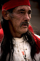
Anchored to the pastby patrinusComment by dr rick: Greetings from the Critique Club
This photo brings out some of the personality of the model. Nice textures on the face, and the pose works well, giving the feeling of a glimpse into his real self, not the facade seen in standard portraits. The red headband is especially useful, adding a touch of color and generally complementing the subject. Lighting is a bit harsh, but probably unavoidable for a candid shot like this and certainly adequate; nothing important is burned out or in deep shadow. The balance is poor, with the cropped head but full chest. I think framing the photo a little higher, getting the whole head and less chest, would have been more effective, both improving the balance and minimizing the white area that tries to grab the viewer's attention. |
| 03/01/2006 12:10:52 PM |
Applesby patrinusComment by Chinabun: overall i like the photo, woulve liked to have seen the whole basket but the red background goes well with it.8 |
| Photographer found comment helpful. |
| 03/01/2006 03:38:58 AM |
Invisible for everyoneby patrinusComment by alexgarcia: Sorry for your place. I didn't vote all the photos of the challenge, but this was my only 10. I think is superb, and is added to my favorites. That is one of the things of DPC, we're a great and big community and there are many different opinions.
Regards.
Álex. |
| Photographer found comment helpful. |
| 02/28/2006 09:19:52 AM |
|
| Photographer found comment helpful. |
| 02/26/2006 08:16:53 PM |
|
| Photographer found comment helpful. |
| 02/26/2006 01:39:48 PM |
|
| Photographer found comment helpful. |
| 02/25/2006 10:24:39 PM |
|
| Photographer found comment helpful. |
Home -
Challenges -
Community -
League -
Photos -
Cameras -
Lenses -
Learn -
Help -
Terms of Use -
Privacy -
Top ^
DPChallenge, and website content and design, Copyright © 2001-2026 Challenging Technologies, LLC.
All digital photo copyrights belong to the photographers and may not be used without permission.
Current Server Time: 07/27/2026 09:33:56 AM EDT.