MUGGEDby
ktm7Comment by ddng: Critique Club Comment
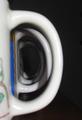
COMPOSITION
This photograph is really not say much to me. I'm sorry to say but it really looks as though it was simply put together for the challenge and not a carefully thought out and implemented photo.
As has been said before, the shadows are really distracting from the ultimate point of the photo and I think also the colours of the mugs. Perhaps it would have been more effective to use uniform mugs?
Also something just seems to be off about the whole composition - there seems to be either too much or too little black space on the right.
Your DOF also seems to be off with the first mug being blurred. IMO it would have been more effective to have the first mug in focus and have the mugs blurring as they go on.
BACKGROUND
The black background was a good idea and it adds to the image rather than distracting the viewer. As I said before though, there either seems to be too much of it or too little of it.
CAMERA WORK
The subject is not focused properly and I don't find the image to be sharp and effective.
The lighting could have been used a lot more effectively as well.
MY OPINION
I know this is beginning to sound quite harsh but I am hoping that you will take this the way it is meant - constructive criticism. Don't forget that it is only my opinion!
If I were to see an edited and redone version of this photo I would like to see better lighting to take the shadows off the handles, all of the mugs the same colour and pattern and a shift in the focus to have the first mug in focus rather than the last.