| Image |
Comment |
| 06/16/2003 01:56:45 AM |
|
 Photographer found comment helpful. Photographer found comment helpful. |
| 06/16/2003 01:54:29 AM |
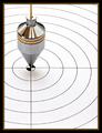
Self-Centeredby orussellComment by Malokata: Cool concentric circles, this would make a nice addition to an art deco-styled room. The border is a nice touch. |
| Photographer found comment helpful. |
| 06/16/2003 01:01:25 AM |
|
| Photographer found comment helpful. |
| 06/15/2003 10:09:38 PM |
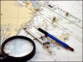
Office at Seaby orussellComment by p_johns: I rekon that color toning would have definitely added to this picture. It seems to lack the interest that toning would have given here. |
| Photographer found comment helpful. |
| 06/14/2003 08:44:32 PM |
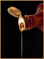
Liquid Goldby orussellComment by Gracious: Greetings from the critique club.
I think this is a fine photo. Simple and clean composition with no extraneous clutter. Although the sream is slender, it still is the center of attention.
Your lighting is fantastic! The extra effort you made paid off in a vg image. It was well thought out and executed.
The bg being black works very well here. What did you use for the bg?
The processing you did with Neat Image and PS worked just fine. The image is crisp and clean with no noise or jaggies.
This is a picture to be proud of. I like it very much.
Keep up the good work. I'll look forward to seeing more of your work.
Regards,
Grayce aka Gracious |
| Photographer found comment helpful. |
| 06/14/2003 12:33:49 AM |
|
| Photographer found comment helpful. |
| 06/13/2003 05:56:27 PM |
Office at Seaby orussellComment by qachyk: You know, I think I have that compass.
Anyhow. I don't know, this doesn't really scream 'office' to me, although it does say 'job', so it's not out of the question. It looks reasonably natural-setting rather than staged, which is nice. |
| Photographer found comment helpful. |
| 06/12/2003 03:30:22 PM |
rrrrRing.....@#$%!!!by orussellComment by orussell: Originally posted by hbunch7187:
*Critique Club*
I almost didn't notice the motion blurr, but I was trying to figure out where the sharpest focus was, and couldn't find it, but then found the motion blurr.
I wish that more of the clock were in focus, and that the motion blurr stood out a bit more. As is, it's not really obvious enough to stand out at us as the main part of the photo. Also, the numbers on the clock being a bit oof bother me a bit.
The angle and framing/cropping are good. I like how you centered the clock, but also like how you took the shot from a little bit of a 'from above' angle. This gives it a bit of visual appeal.
I'm not really sure about the reflections in the clock. The one on the right bell looks like a reflection of the photographer, and it looks like the photographer is holding the camera, or at least touching it. If this is true, had you set the camera down on something to avoid any camera shake, the actual clock could have turned out a bit sharper.
I think that this fits nicely into the Sound challenge and portrays it very well.
~Heather~ |
Thanks Heather,
Now I see why crabappl3's came 5th and mine came 44th. :) |
| 06/12/2003 01:44:08 PM |
rrrrRing.....@#$%!!!by orussellComment by HBunch: *Critique Club*
I almost didn't notice the motion blurr, but I was trying to figure out where the sharpest focus was, and couldn't find it, but then found the motion blurr.
I wish that more of the clock were in focus, and that the motion blurr stood out a bit more. As is, it's not really obvious enough to stand out at us as the main part of the photo. Also, the numbers on the clock being a bit oof bother me a bit.
The angle and framing/cropping are good. I like how you centered the clock, but also like how you took the shot from a little bit of a 'from above' angle. This gives it a bit of visual appeal.
I'm not really sure about the reflections in the clock. The one on the right bell looks like a reflection of the photographer, and it looks like the photographer is holding the camera, or at least touching it. If this is true, had you set the camera down on something to avoid any camera shake, the actual clock could have turned out a bit sharper.
I think that this fits nicely into the Sound challenge and portrays it very well.
~Heather~ |
| Photographer found comment helpful. |
| 06/10/2003 09:07:54 PM |
Liquid Goldby orussellComment by SweetKali: beautifully photographed, but there's something missing...there's no 'punch' to the subject matter; the eye isn't drawn to study the imagery in a curious manner. |
| Photographer found comment helpful. |
Home -
Challenges -
Community -
League -
Photos -
Cameras -
Lenses -
Learn -
Help -
Terms of Use -
Privacy -
Top ^
DPChallenge, and website content and design, Copyright © 2001-2026 Challenging Technologies, LLC.
All digital photo copyrights belong to the photographers and may not be used without permission.
Current Server Time: 07/16/2026 04:05:00 PM EDT.