| Image |
Comment |
| 01/28/2004 10:09:48 PM |
|
 Photographer found comment helpful. Photographer found comment helpful. |
| 01/28/2004 07:58:47 PM |
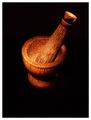
Mortar and Pestelby orussellComment by jmsetzler: I think your subject choice here is strong. The composition feels a bit strange for me.. it looks like your subject is floating in space with the darnkess... I think a little light on the surface could be a nice enhancement :) |
| Photographer found comment helpful. |
| 01/27/2004 10:08:21 PM |
Mortar and Pestelby orussellComment by timmi: Very very beautiful. The texture of the mortar comes really alive. I am not big fan of thick white borders around black images, it realy distracts from the beauty of this photo. The image is very good on it's own, no need for a thick frame. |
| Photographer found comment helpful. |
| 01/27/2004 04:12:12 PM |
|
| Photographer found comment helpful. |
| 01/27/2004 02:04:05 PM |
|
| Photographer found comment helpful. |
| 01/27/2004 12:08:41 AM |
Mortar and Pestelby orussellComment by nephrotic: There are some beautiful pictures in this challenge and this is another one of them. Personally I would like to have seen it cropped a little tighter. There would still be enough black to leave the pestle and mortar "leaping out of the page"
I will copy a note though that I have copied to some other people in this challenge.
---
My only concern is, as you may have guessed from the amount of discussion on the forum re "painting with light" is whether it is painting with light.
Having been lucky enough to judge what is now a few hundred competitions in the last 30 years I feel I should say the first thing that happens is that they are sorted and any that do not immediatly seem to fit the category are dumped (hard but a fact). This is why so many competitions also run an "open category". Your picture, as impressive as it is, would, I feel have been rejected at this stage. "Painting with Light" has a fairly tight definition in photography but still allows a lot of lattitude for creativity.
I suspect that your scores may not reflect what the picture is worth which is a great shame.
I believe if I was judging in another category I would have gone for an 8 possibly a 9 because you have managed to getget the light to work the textures so well.
I do hope you understand my reasons for marking it down
David
|
| Photographer found comment helpful. |
| 01/26/2004 09:34:32 PM |
|
| Photographer found comment helpful. |
| 01/26/2004 04:52:15 PM |
|
| Photographer found comment helpful. |
| 01/26/2004 01:56:22 PM |
|
| Photographer found comment helpful. |
| 01/26/2004 01:39:39 PM |
Mortar and Pestelby orussellComment by justine: Good use of light. I only dislike the perspective...or maybe it's the crop? One of them seems a bit imbalanced. It could be all the dead space at the bottom, making this look as if it's floating..? Not sure. It's a good shot, very good. Nice focus and as I said good lighting. All the best in the challenge. |
| Photographer found comment helpful. |
Home -
Challenges -
Community -
League -
Photos -
Cameras -
Lenses -
Learn -
Help -
Terms of Use -
Privacy -
Top ^
DPChallenge, and website content and design, Copyright © 2001-2026 Challenging Technologies, LLC.
All digital photo copyrights belong to the photographers and may not be used without permission.
Current Server Time: 07/17/2026 12:25:50 PM EDT.