| Image |
Comment |
| 02/18/2004 10:17:12 AM |
|
| 02/18/2004 02:11:54 AM |
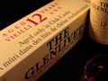
Smoothby orussellComment by Quadrajet: Clever take on the subject matter. I like the composition you have going on here and your exposure is spot on. My eye keeps on going to the upper right hand corner and unfortunately what I see is half a label. I guess in my opinion, either a full label or showing a bit more of the label would help to make the image more complete. I hope this helps. |
 Photographer found comment helpful. Photographer found comment helpful. |
| 02/18/2004 02:01:25 AM |
|
| Photographer found comment helpful. |
| 02/18/2004 01:09:22 AM |
|
| Photographer found comment helpful. |
| 02/18/2004 01:01:08 AM |
Smoothby orussellComment by Prof_Fate: the glass of scotch is too dark. read of a trick - use a mirror behind it to reflec the light and make it almost glow. the composition seems off too..too much box - the words are all there -too pbvious perhaps..too little bottle, too little too dark a glass |
| Photographer found comment helpful. |
| 02/17/2004 03:40:05 PM |
|
| Photographer found comment helpful. |
| 02/17/2004 12:19:06 AM |
|
| Photographer found comment helpful. |
| 02/16/2004 08:51:51 AM |
Buck - An American Classicby orussellComment by moodville: Good diagonal, excellent lighting, the texture in both the foreground item and the background compliment each other well. The chrone is well lit and shiny without losing any details. Would make a great advertising shot. |
| Photographer found comment helpful. |
| 02/15/2004 02:23:39 PM |
Jinxedby orussellComment by GeneralE: I was just looking for my Scabble set a few minutes ago ... I'd have used the horizontal word (diner) in the title to reinforce in the voters' minds the shallowness of focus. I just hope I don't jinx your entry! |
| Photographer found comment helpful. |
| 02/11/2004 08:40:29 PM |
Nut and Boltby orussellComment by dr rick: Greetings from the Critique Club!
The message
To me, this image nicely shows both the similarities and differences between these two items that obviously go together. The common color and functionality tie them together, while the separation between them emphasizes the differing textures and very different shapes. Overall a fairly interesting image, although not really compelling.
Creative choices
The lighting here is so-so; it shows the textures OK but there is too much glare and the shadows aren't very interesting. Using a smaller key light positioned a bit lower and reducing the fill or ambient light would have created shadows that were sharper, longer, and darker, thus more exciting. The composition works well; the diagonal orientation of the bolt makes it dynamic, and having it point toward the nut helps tie the elements together. The elements are positioned well in the frame. The DOF is pretty shallow--the front of the nut and back of the bolt are blurry--and I'm not sure what this adds; I'd rather see everything in focus.
Technical aspects
The exposure is great. So is the focus, although it is somewhat soft; sharpening would show off the textures better. There is a nice tonal range, and the color is nicely subtle. The noise in the shadows is mildly distracting. |
| Photographer found comment helpful. |
Home -
Challenges -
Community -
League -
Photos -
Cameras -
Lenses -
Learn -
Help -
Terms of Use -
Privacy -
Top ^
DPChallenge, and website content and design, Copyright © 2001-2026 Challenging Technologies, LLC.
All digital photo copyrights belong to the photographers and may not be used without permission.
Current Server Time: 07/17/2026 05:00:28 AM EDT.