| Image |
Comment |
| 05/14/2006 02:39:51 AM |
|
 Photographer found comment helpful. Photographer found comment helpful. |
| 05/12/2006 11:46:15 PM |
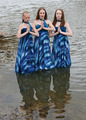
Bearing the Crossby angela_packardComment by Makka: * Greetings from the Critique Club *
Hmmm...interesting photo here. Reading through the comments you received it appears some people didn't like the theme you used, but as for myself being a very non-religious person I won't take any view on it here.
The main thing that I see looking at this photo is that she's not really popping out from the background. Her outfit and the rock formations kind of blend together to a certain degree. I've noticed in your comments that you used a little dodge and burn on the photo. In my opinion I would of liked to have seen a little more, especially on that awesome cloudy sky in the background and a little more on the rock formations (which by the way are really cool).
The focus seems pretty crisp and it's a nice balancing DOF that you've used. Maybe you could of tried the a slightly different crop so she wasn't so central or maybe shot from a slightly different angle? It's hard to say without having been there and seen what was around, plus, as you mentioned it was for a dance shoot.
Overall it's a nice photo. I'm not a big fan of the expression on her face though. Maybe a slightly different pose with the cross could of made this a lot more powerful?
Maybe some of these points may of helped your score a little, it's always hard to say because everyone has differing opinions. You've got some fantastic photos in your portfolio there so keep at it. I'm sure more ribbons will come your way!
Neil
|
| Photographer found comment helpful. |
| 05/11/2006 10:47:48 PM |
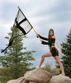
Triumphby angela_packardComment by timfythetoo: Greetings from the Critique Club -
First let me begin with the fact that photojournalism is not my expertise. With my limited knowledge, this shot seems a bit too "set up" with what I think pj is.
I believe if the colors had stood out more the shot would have been a bit more interesting. They seem flat and the dull green just isnt nice. Same with the sky. More color would have helped. The position of the flag against the back drop of the tree draws away from the flag. That it is see through makes it blend in with the tree even more.
The detail is sharp and the model is attractive, but I dont think it was enough to carry the picture. I am just not sure what the story is or what it relates to, even with the title. I wouldnt expect to see this shot in a newspaper.
You have a strong number of pictures in your challenge portfolio that are quite impressive. This may just be a hiccup on the path. I look forward to seeing what else you come up with in the future.
Tim |
| Photographer found comment helpful. |
| 05/11/2006 10:41:42 AM |
|
| Photographer found comment helpful. |
| 05/11/2006 08:46:03 AM |
|
| Photographer found comment helpful. |
| 05/11/2006 12:02:08 AM |
|
| Photographer found comment helpful. |
| 05/10/2006 07:53:41 PM |
|
| Photographer found comment helpful. |
| 05/10/2006 06:42:12 PM |
|
| Photographer found comment helpful. |
| 05/10/2006 12:57:48 PM |
|
| Photographer found comment helpful. |
| 05/10/2006 11:35:02 AM |
|
| Photographer found comment helpful. |
Home -
Challenges -
Community -
League -
Photos -
Cameras -
Lenses -
Learn -
Help -
Terms of Use -
Privacy -
Top ^
DPChallenge, and website content and design, Copyright © 2001-2026 Challenging Technologies, LLC.
All digital photo copyrights belong to the photographers and may not be used without permission.
Current Server Time: 07/18/2026 06:01:49 PM EDT.