| Image |
Comment |
| 05/15/2007 01:05:28 AM |
|
 Photographer found comment helpful. Photographer found comment helpful. |
| 05/14/2007 06:10:55 PM |
|
| Photographer found comment helpful. |
| 05/14/2007 05:59:21 PM |
|
| Photographer found comment helpful. |
| 05/14/2007 03:14:56 PM |
|
| Photographer found comment helpful. |
| 05/14/2007 12:59:39 AM |
|
| Photographer found comment helpful. |
| 05/08/2007 09:27:47 PM |
Taylarby angela_packardComment by karmat: CRITIQUE CLUB CRITIQUE
by karmat
NO!! No more snow or cold weather, please!!! :)
Compositionally, I love the angle of this shot. It is interesting and and pleasing as well. It also seems a natural pose for a young girl. I also like that she is not "straight" in the frame, but tilted just a bit. Again, I think this adds to the youthfulness and playfulness of the shot.
Technically, the colors are very pleasing. The green balls were a bit distracting at first, because I couldn't tell where they "originated" or why they were there. Otherwise, the pink really sits nicely against the snow. The focus is good and sharp, and I think you have done well to exposure her face and "front" as well as you have without blowing out the snow. My only nitpick is that her face is too smooth. There is little or no detail left there at all. Since this is a portrait, that is the main focal point, and it seems unnatural. My apologies if her skin is naturally that smooth, but it seems like a result of noise reduction.
Awesome shot, and if I need to further clarify or explain myself, please let me know.
karma
|
| Photographer found comment helpful. |
| 05/07/2007 10:18:26 PM |
Triptych Outtake.jpgby angela_packardComment by timfythetoo: Hey Angela - I think this would have scored better for you in the challenge. Where in your original entry you have a great image that was just divided by the lines - here you have more of a story going on. You are presenting different views that go great together. The only thing that I might change is have the right image of your daughters hand separate from the edge of the main pic - like you have on the left side. That might balance it out a bit better. I think this would have easily scored higher for you.
And congrats on your daughter! You will never ever EVER get sick of taking pics of her - though others may get sick of seeing them ;) And to that you tell them all "Tough noogies!!!" Have a blast documenting anything and everything. I have found that my kids make the best models. I always have the camera out and they are almost always ready to pose for me. Congratulations and have a blast! |
| Photographer found comment helpful. |
| 05/07/2007 09:02:57 AM |
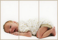
Pure Innocenceby angela_packardComment by timfythetoo: Greetings from the Critique Club -
Always happy to pull one of your images. As a single image this is great. Great lighting, nice subtle colors and I like how the outfit just kind of blends into the background. On top of that the look is priceless. A very nice image overall.
As for the challenge I am not sure if its the best choice. You met the challenge with the division into three parts, but I am not sure if thats the best choice for this pic. I would prefer to have this image without the borders and just had baby all to him/herself. I am not sure if I could suggest a way that splitting it into three would have served you better.
Again - very nice image. I really have no issues with any of the technical or artistic choices made. Get rid of the borders and print this baby out.
Tim |
| Photographer found comment helpful. |
| 05/06/2007 03:55:37 AM |
Pure Innocenceby angela_packardComment by levyj413: Simply splitting a single image doesn't really do much for me. Now, if the middle section were offset vertically, it'd add some punch.
Cute shot, though! |
| Photographer found comment helpful. |
| 05/04/2007 05:04:15 AM |
Pure Innocenceby angela_packardComment by owen: Perfect lighting and shot of the baby. The amount of space at the top doesn't seem to suit this great shot though. |
| Photographer found comment helpful. |
Home -
Challenges -
Community -
League -
Photos -
Cameras -
Lenses -
Learn -
Help -
Terms of Use -
Privacy -
Top ^
DPChallenge, and website content and design, Copyright © 2001-2026 Challenging Technologies, LLC.
All digital photo copyrights belong to the photographers and may not be used without permission.
Current Server Time: 07/15/2026 10:42:56 PM EDT.