| Image |
Comment |
| 04/20/2002 04:15:00 AM |
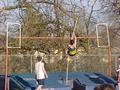
Up, Up, Up!by ohsmomComment by cinnery: Good subject idea, maybe a different angle wouldn't have lost the subject in the background. |
| 04/20/2002 12:25:00 AM |
Up, Up, Up!by ohsmomComment by AllanL: Feels too much like a snap shot...I don't like the head in the lower right corner. And the color is washed out. Overall, it's not compositional interesting. |
| 04/19/2002 08:22:00 AM |
Up, Up, Up!by ohsmomComment by chariot: Nice try. This would have been great if you could have gotten the guy as he was going over the cross bar. |
| 04/19/2002 07:30:00 AM |
|
| 04/19/2002 06:54:00 AM |
|
| 04/19/2002 01:18:00 AM |
Up, Up, Up!by ohsmomComment by Mousie: i would have tried moving the framing down a little so you could see the whole kid in the front, and the mat to boot. it would also make the valut feel higher and more daring! |
| 04/18/2002 03:10:00 PM |
|
| 04/18/2002 02:34:00 PM |
Up, Up, Up!by ohsmomComment by karmat: From the side or front, and being closer may have made this more interesting. |
| 04/18/2002 10:21:00 AM |
|
| 04/18/2002 01:57:00 AM |
Up, Up, Up!by ohsmomComment by Ricky Cleave: A closer up shot would have been more favorable plus having tooken the picture at the apex and a different angle |
Home -
Challenges -
Community -
League -
Photos -
Cameras -
Lenses -
Learn -
Help -
Terms of Use -
Privacy -
Top ^
DPChallenge, and website content and design, Copyright © 2001-2026 Challenging Technologies, LLC.
All digital photo copyrights belong to the photographers and may not be used without permission.
Current Server Time: 07/16/2026 12:41:01 AM EDT.