| Image |
Comment |
| 11/05/2005 04:50:52 PM |
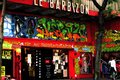
Street language.jpgby elee3009Comment by Jammur: Wow colors! Strong yet subdued. The man leaving the frame is a very strong element, almost the only white in the picture. I can't help thinking Cartier-Bresson. I just noticed how the cartoon face seems to be leering at the man. |
 Photographer found comment helpful. Photographer found comment helpful. |
| 11/05/2005 04:39:25 PM |
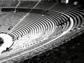
Roman Arenaby elee3009Comment by Jammur: Really like the perspective (read POV). The repeatitive symmetry is great, especially since it carries to the arena floor. The tonal range might be weak in the highlights, but that could be my monitor. For me the only weaknesses are the non-Roman artifacts at the top right. |
| Photographer found comment helpful. |
| 11/05/2005 03:54:45 PM |
Roman Arenaby elee3009Comment by justin_hewlett: I really like this photo and would have to disagree with pekesty's comment. It works well as a contrasty black and white shot and the repitition of curved lines works wonders for the photo and keeps me interested for a long time. My only gripe is the dominance of the dark lower-right corner - it takes up almost a third of the entire composition and distracts a bit from the rest of the photo. Other than that an excellent photo. Would you mind posting the original so I can see what you had to work from? Maybe I can offer a few tips and possible ways of dealing with the lower-right corner. Nice job here. Message edited by author 2005-11-05 15:55:21. |
| Photographer found comment helpful. |
| 11/05/2005 11:10:41 AM |
Roman Arenaby elee3009Comment by UNTITLED: This is tough one to comment on, It doesn't have that artistic flair that so many of your photos have. This one seems a bit flat, it reminds some of a historical photo you would see in a museum. For that type of photo its very good, but I would rather see your artistic flair. Message edited by author 2005-11-22 11:30:10. |
| Photographer found comment helpful. |
| 11/05/2005 11:05:21 AM |
Street language.jpgby elee3009Comment by UNTITLED: I love this photo, its so bright and bold very interesting. It could be a little bit sharper, but that's just minor. I think it might be interesting if the man in the whiter shirt was still more in the picture, instead of leaving it. He does draw the eye over and then out, a bit. |
| Photographer found comment helpful. |
| 11/04/2005 09:23:37 AM |
|
| Photographer found comment helpful. |
| 11/04/2005 08:32:46 AM |
|
| Photographer found comment helpful. |
| 11/04/2005 08:32:11 AM |
|
| Photographer found comment helpful. |
| 11/04/2005 08:28:54 AM |
|
| Photographer found comment helpful. |
| 11/02/2005 09:20:11 PM |
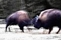
Dance of Great Bison Spiritsby elee3009Comment by Man_Called_Horse: I know what you were after, but part of this shutter speed challenge is to have some crispness, at least, athe very least in your subjects eyes, or face. This is WAY too blurry. Try to take more than one pix next time and experiment with your shutter.
color ok, a bit bright, blacks good, whites need work, texture ok, comp needs work,lighting can't tell |
| Photographer found comment helpful. |
Home -
Challenges -
Community -
League -
Photos -
Cameras -
Lenses -
Learn -
Help -
Terms of Use -
Privacy -
Top ^
DPChallenge, and website content and design, Copyright © 2001-2026 Challenging Technologies, LLC.
All digital photo copyrights belong to the photographers and may not be used without permission.
Current Server Time: 07/16/2026 12:20:25 PM EDT.