| Image |
Comment |
| 04/11/2006 09:40:06 AM |
|
 Photographer found comment helpful. Photographer found comment helpful. |
| 04/10/2006 06:11:25 AM |
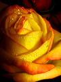
Exquisite freshnessby elee3009Comment by macrothing: I only voted about 30% in this Challenge, but this was one I voted on and I gave it a 7. The color(s) and texture of the rose was nice and it 'said' yellow enough for me, but even more so would have been better, especially for this Challenge, in my opinion. The texture and drop perhaps could have been sharper, &/or the focal point adjusted to emphasize them. This shot even without the water drops, just showcasing the texture (and colors) would have also worked well in my opinion. I liked the concept but if the focal point was further forward, perhaps a variation in framing (perhaps a little wider, not sure) and either more of the 'other' roses, of different color, showing in the composition, therefore making the yellow one 'pop' against them more, otherwise the others eliminated and this all about this unusually colored rose, may have all helped make this even better in my opinion. Perhaps overall just a fraction dark too - but just my opinion/taste. I rarely like the 'sterile' roses/flowers in studio set up (not that this looks like one). edit:typo & wordingMessage edited by author 2006-04-10 06:42:15. |
| Photographer found comment helpful. |
| 04/10/2006 05:50:47 AM |
Exquisite freshnessby elee3009Comment by hotpasta: Eileen, for me there are a couple of other roses in your portfolio that are better than this one, but I would have added just a little more light to the LHS and dodged out the rose at the back. This is an excellent shot. Looking back, I gave it a 6. Hmmm, maybe I was all flowered out in the voting. It's a great shot |
| Photographer found comment helpful. |
| 04/10/2006 04:30:17 AM |
Exquisite freshnessby elee3009Comment by DanSig: this subject can be photographed to get a 6.XX score, but there are a few things wrong in this image to score that high.
1. the bacground must go, just paint it black.
2. the whole flower needs to be in the picture
3. the angle is to low, try showing more inside the flower
4. the flower needs more light, too many dark places.
the good parts...
1. I like the freshness the water droplet gives
2 I like the color in this rose
3. I like the composition, keep the center of the rose on the rule of thirds
4. I like the deep DOF.
ok.. now you got some pointers on what can be improoved and what should stay the same.. go shoot another image and post again :) |
| Photographer found comment helpful. |
| 04/10/2006 04:28:43 AM |
Exquisite freshnessby elee3009Comment by crayon: You asked for honest opinions, here's my take:
this photo is good, and it could have been great.
In my opinion, some adjustment in the curves would enhance the tones and highlight the contrasts. The colours appear a little over-saturated, especially the tangerine highlights. Alas, I think the slight issue here is that there is no "focus point" for the viewer's eye to rest on (dunno if this is good or bad with the voters tho) which to me, is a little unsettling.
All that said, frankly I'm not a "flower" person so do take my comments with some grain of salt :) cheers. |
| Photographer found comment helpful. |
| 04/10/2006 04:10:47 AM |
Exquisite freshnessby elee3009Comment by goc: good shot, i like it
there is nothing wrong with the shot in my opinion,
i dont know, the photo is dynamic and static in the same moment,
really confusing when you look at it for a minute or less :-)
the red is nice addition in my opinion, i didnt vote on this one but i'll go with 7 or 8,
water droplets are alos very cool
peace,
goran |
| Photographer found comment helpful. |
| 04/10/2006 03:26:06 AM |
|
| Photographer found comment helpful. |
| 04/09/2006 09:12:43 PM |
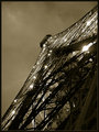
The Eiffel in Sepiaby elee3009Comment by hotpasta: This is one of the best shots of the tower I have seen (mine included!) The sky looks so brooding and the lights look like stars. Well done Eileen! |
| Photographer found comment helpful. |
| 04/09/2006 09:11:33 PM |
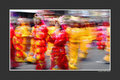
Red and Gold Paradeby elee3009Comment by hotpasta: There's great movement here Eileen! Excellent colour and a great idea. Love the framing as I think it suits this shot. You have captured the mood of this parade really well |
| Photographer found comment helpful. |
| 04/09/2006 09:10:11 PM |
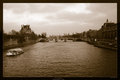
Where Time Stands Stillby elee3009Comment by hotpasta: Ahhh La Siene! This is a postcard Eileen. I like it both in colour and in sepia. The graininess creates a great mood in this shot Eileen. I walked on that bridge with my family in November 2005! Time looks like it stands still there, but when you cross the bridge...that's another story! |
| Photographer found comment helpful. |
Home -
Challenges -
Community -
League -
Photos -
Cameras -
Lenses -
Learn -
Help -
Terms of Use -
Privacy -
Top ^
DPChallenge, and website content and design, Copyright © 2001-2026 Challenging Technologies, LLC.
All digital photo copyrights belong to the photographers and may not be used without permission.
Current Server Time: 07/17/2026 02:45:47 PM EDT.