| Image |
Comment |
| 04/19/2006 07:18:02 AM |
|
 Photographer found comment helpful. Photographer found comment helpful. |
| 04/17/2006 06:16:14 PM |
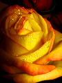
Exquisite freshnessby elee3009Comment by UNTITLED: I really liked the colors and tones of this. I thought the composition and the overall sharpness were very good too. But I think the main reason I only voted this a six was the shadow/darkness on the left side didn't look quite natural to me.
~Mark Message edited by author 2006-04-19 10:32:00. |
| Photographer found comment helpful. |
| 04/14/2006 11:40:16 AM |
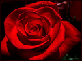
Velvet Rhapsodyby elee3009Comment by elee3009: Wow, thanks a lot guys! My first 6 ... :D Really should thank hubby for pushing me to enter this one.
Appreciate all the helpful comments and constructive feedback. Many pointed out the background would have been better blackened with no detail, even for my previous entry in Yellow. Going by the high votes for such images, I certainly won't disagree. But I still stand with my choice not to do it that way. I actually like the natural bits of subdued colour and design in the back as long as it doesn't make the image look busy. Guess it's personal taste. :)
|
| 04/14/2006 01:50:08 AM |
Velvet Rhapsodyby elee3009Comment by eschelar: Very, Very, Very nice.
I actually like the deep DOF on this one, I feel that the leaves are able to add a little something out of the ordinary as well as the other objects in the back. Very nicely done. I think you do a great job with that 'style' of effective background objects to lens a mood. Others keep commenting that they don't like it, but I think the only thing that does is affect the votes slightly. Photographically, it's very nice IMHO.
The only real thing I don't like is the pink fringing that has shown up in places. It's a bit odd and I'm not sure the source. You might use a selective color to shift it every so slightly towards the red scale.
Incidentally, you will notice that your rose is centered on the inner left fifth rather than a third. Works beautifully.
This also proves that you indeed CAN cut off some of the edges of some subjects and retain excellent quality.
PS. HUGE improvement over the yellow rose.
|
| Photographer found comment helpful. |
| 04/14/2006 12:37:18 AM |
|
| Photographer found comment helpful. |
| 04/14/2006 12:35:07 AM |
Velvet Rhapsodyby elee3009Comment by hotpasta: Hi Eileen, I really expected this to do so much better. The title really described the texture you have captured in this shot. I gave this an 8, only because of the little bits of distraction in the background, but they weren't that huge. You really do these type of shots well. Keep going...AND WORK ON THAT SELF PORTRAIT!!!! Lovely shot |
| Photographer found comment helpful. |
| 04/14/2006 12:13:35 AM |
Velvet Rhapsodyby elee3009Comment by UNTITLED: Alright, way to kick butt and get a new personal best!!! Some amazing shadow and highlights by the way. Rich and vibrant as well. You rock!!!
~Mark
Oh yeah, have to disagree with you this one is the better! ;)
|
| Photographer found comment helpful. |
| 04/13/2006 11:32:33 PM |
|
| Photographer found comment helpful. |
| 04/12/2006 07:15:55 AM |
|
| Photographer found comment helpful. |
| 04/12/2006 04:50:15 AM |
Velvet Rhapsodyby elee3009Comment by wsteyn: Great use of light to emphasize the textures. This is an advanced editing challenge, so I would have removed, or blurred, the objects in the corners. |
| Photographer found comment helpful. |
Home -
Challenges -
Community -
League -
Photos -
Cameras -
Lenses -
Learn -
Help -
Terms of Use -
Privacy -
Top ^
DPChallenge, and website content and design, Copyright © 2001-2026 Challenging Technologies, LLC.
All digital photo copyrights belong to the photographers and may not be used without permission.
Current Server Time: 07/17/2026 07:46:32 PM EDT.