Reaching out of the blue into a better moodby
SlimharpoComment by stephan: Hello Sam, don't wonder why you get another critique. Your your photo was assigned to me in context of Critique Club. So here it goes:
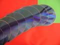
Composition: Good composition. I think you used the space quite good by placing the arm on the diagonal and filling almost the whole frame.
The thing in your hand is a bit distracting. Do you hold something? Looks like a face but I can't really make out what it could be.
Lighting/Colours: This is not so good in my opinion. First of all the red vs. green is too much colour contrast, it's hurting my eyes! I guess you wanted to use these colours as a metaphor to the "better mood" you describe in the title (with red being danger and green symbolising hope). That's a nice idea but it's not very pleasing to the eye ;-) I think two different shades of yellow would have worked better. Also because that would have emphasised the blue of the CD much better.
I know that's probably impossible but I think the reflections also distract from your actual idea.
Also there are some bumps in your red sheet of paper and there is a small shadow in the upper left and lower right corner.
Focus: Some parts are a bit out of focus, e.g. the bottom left corner or on the red/green edges. Unfortunately you didn't provide any details about your camera settings, but maybe the aperture was too wide and made the DOF too shallow (which in my opinion doesn't work for such a shot).
Digital processing: You used only 96kB file size of the jpeg file. You can use up to 150kB when submitting to DPC. The bigger the file size the higher the quality and the less jpeg artifacts you have.
Art: A creative idea! I guess it took you some time to arrange everything. Unfortunately the blue colour is dominated by the red/green contrast. That's especially sad because the challenge theme was "blue".