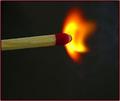
Not the DEAD End of a Match Stick....yet!by
AzCKellyComment by DrAchoo: I haven't looked at other comments so if I'm repeating, then it's how I feel. :) First, I think you did very well with a difficult subject to capture. Flame is always hard to get right. With that being said I think the following hurt your score:
1) The DNMC crew may not have liked this. I'm pretty liberal, but this is a bit of a stretch. It's "out-of-the-box" which can be great, but like I've said before, high risk/high reward.
2) The flame is supersaturated which makes it less interesting. The colors are beautiful, but there is little detail there and the resultant rounded edges make it look less like flame and more like a glow of something.
3) The composition isn't bad at all. I may have actually had the match enter the frame centered and then let the gradual slope move the subject away from the middle. In other words, I may have just shifted the subject down. Rule of thirds is good and all, but sometimes it doesn't work and I think when you have a completely black background centered often works better.
4) Did you use optical zoom for this? It seems just a tiny bit jaggy. Not bad though.
5) I will totally commend you for the lighting on the matchstick. You managed to light that quite well while still controlling for the light of the flame. That is tough.
So bottom line is a fairly well done technical picture which likely fell with the DNMC crowd. (Note the 13 3-scores). The saturation may have been overboard. You did well though with a very difficult to photograph subject.