If You Were Smallby
gclarkComment by Artyste: Hello, and greetings from the Critique Club. The critique you are about to recieve is tailored for DPC challenges alone, and is not intended to be seen as an artistic critique per se.
Initial Thoughts
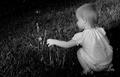
A pretty good shot, nice colors, a little cramped.
Compostion / Content
While it's an interesting view and composition, I believe that a couple of things would have really improved it over what it is (and what it is isn't *bad* by any means.. ending up under a 5 with this shot really kind of perplexes me). I think that using landscape orientation is a good choice, but to really make this shot stand out, I think a slightly lower perspective, and getting the whole of the initial flower in frame (and using a wider angle), would have stood this out a lot more. Cutting the main subject off lends to a more cramped feel in a photograph, especially if you have background elements that are clutterish. A wider angle for this type of perspective shot is almost a must to give it a more dynamic flow.. although I know that it isn't always possible. Still, a few degrees lower and tilted upwards to isolate the flower more, and I think you'd have pulled out a few higher scores.
Background
As you have it, the stems and stalks of the rest of the flora are just more of a clutter than they are a help to the photo. They do add a sense of depth, but there are just too many for the perspective you've chosen, which makes the plane feel flatter, and the photo more cramped than it could have been.
Camera Work / Technical
You've done a fine job in this area, IMO. A really nice exposure, some great focus, and the depth of field was achieved very nicely. It has a smooth look that seems more natural than not and reminds me of a well done diorama.
Digital Processing
No information given, so I cannot really comment on this area.
Fits the Challenge
It does fit the challenge, but I believe it could have been stronger with just a few slight shifts in your point of view and if you could have used a wider angle.
My Opinion of the Photo
I like this myself, despite the things I've mentioned. I am honestly confused why it finished as low as it did, but one comment seems to be that there were a lot of this type of photograph in the challenge. If that was the case, that could have been a contributing factor, along with the elements I mentioned. Regardless, I think it's a step in the right direction, has a good strong technical element, and deserved to be higher. Good luck in future challenges.