| Image |
Comment |
| 08/27/2005 02:42:11 PM |
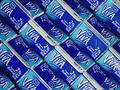
Milkohalicby stamComment by m--E: This is pop art - I like it! Maybe should have straighten the tops of all of the cartons a bit, but the angle is great! |
| 08/27/2005 11:48:39 AM |
|
| 08/26/2005 09:25:21 PM |
|
| 08/26/2005 12:38:38 PM |
|
| 08/26/2005 11:31:25 AM |
Milkohalicby stamComment by Caine: Since uniformity is the goal here, I would have straightened the tops of the cartons so they all faced the same way. The focus seems ever so slightly off as well. And the whites in the picture could be whiter. Using a filler flash or something maybe. |
| 08/25/2005 09:39:39 PM |
|
| 08/25/2005 08:18:20 PM |
|
| 08/25/2005 06:13:05 PM |
Milkohalicby stamComment by CLarson557: Great compsition. I like this shot. Nicely framed...I like the angle. I think it could be just a tad sharper. 9 |
| 08/24/2005 06:52:19 PM |
|
| 08/24/2005 03:50:53 PM |
Milkohalicby stamComment by Tammer: As a graphic designer I really like the visual you present. Nicely done! |
Home -
Challenges -
Community -
League -
Photos -
Cameras -
Lenses -
Learn -
Help -
Terms of Use -
Privacy -
Top ^
DPChallenge, and website content and design, Copyright © 2001-2026 Challenging Technologies, LLC.
All digital photo copyrights belong to the photographers and may not be used without permission.
Current Server Time: 07/16/2026 10:41:29 PM EDT.