| Image |
Comment |
| 09/28/2005 09:23:28 PM |
|
 Photographer found comment helpful. Photographer found comment helpful. |
| 09/28/2005 09:25:28 AM |
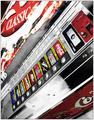
fitty-cent yo!by stekComment by robadsy: i love the tones in this, the high contrast gives real body and strength to the image. well done, and good luck, 8. ads :o) |
| Photographer found comment helpful. |
| 09/28/2005 01:04:04 AM |
fitty-cent yo!by stekComment by DrAchoo: The grey around the large coke sign is weirdly distracting. It is a nice idea though with the selective desaturation. |
| Photographer found comment helpful. |
| 09/26/2005 01:32:46 PM |
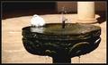
sunbathingby stekComment by livitup: A nice scene.
The title and composition suggest that the bird should be the focal point, but the bird is lacking detail due to overexposure, lack of focus, or both. I'll bet that you framed the picture and took it, which resulted in the camera metering for the darker fountain, instead of the light bird. If your camera can be made to lock the exposure and focus then you should meter for the bird and then compose the photo. Else, you could increase Depth of Field to get the bird AND the fountain in focus, but don't go too far or else you'll bring in the column or the ground, which would be a problem, in my mind. I do like the border. |
| Photographer found comment helpful. |
| 09/24/2005 05:53:05 PM |
sunbathingby stekComment by Riponlady: good idea, bird appears a little blown out - too much post processing? meets challenge and water is good |
| Photographer found comment helpful. |
| 09/22/2005 12:19:01 AM |
|
| 09/21/2005 03:30:48 PM |
sunbathingby stekComment by Jutilda: So cute. If the pillar and floor weren't so beige and mid tone, this would be a great candidate for black and white. I wish the bird were better focused. It's really cute. |
| Photographer found comment helpful. |
| 09/18/2005 09:30:35 PM |
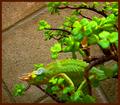
Hanging on a Limbby stekComment by LadeeM: **Greetings from the Critique Club!**
Wow ... now that's green! :) This is a great idea, and I'm not adverse to reptile photos. This one has those really cool eyes that look in all directions. I think what happened here is your selective color and the hue/saturation. Sometimes when you bump the sat level too high, you get artifacts that are hard to get rid of. Also, this green (on the lizard and the leaves) looks really unnatural, and takes away from an otherwise nice photo. The leaves in the foreground that are OOF are a little distracting. My eyes want to wander over to them instead of looking at that awesome specimen of a reptile.
Overall, I think you had a great idea. Composition is good, as well as focus and interest. I just think you over-did the green a little in your attempt to make it stand out more. Hope this helps! :)
Tara |
| 09/18/2005 01:39:41 AM |
|
| 09/17/2005 11:43:49 PM |
|
| Photographer found comment helpful. |
Home -
Challenges -
Community -
League -
Photos -
Cameras -
Lenses -
Learn -
Help -
Terms of Use -
Privacy -
Top ^
DPChallenge, and website content and design, Copyright © 2001-2026 Challenging Technologies, LLC.
All digital photo copyrights belong to the photographers and may not be used without permission.
Current Server Time: 07/16/2026 01:38:45 AM EDT.