DPChallenge: A Digital Photography Contest You are not logged in. (log in or register
 
Browse Settings
Currently viewing:
Registered Username_your_hippie_Van

Show comments:

Per page:

Order:

Comments:


Comments Received by name_your_hippie_Van
Pages:  
Showing 11 - 20 of ~20
Image Comment
the white waterfall
08/24/2005 06:42:11 PM
the white waterfall
by name_your_hippie_Van

Comment by rlinn3:
Looks like a UFO to me. 5
the white waterfall
08/24/2005 04:20:14 PM
the white waterfall
by name_your_hippie_Van

Comment by phylsy7:
I don't like the focus
the white waterfall
08/24/2005 03:31:07 PM
the white waterfall
by name_your_hippie_Van

Comment by docurrie:
very out of focus, colors are very harsh.
the white waterfall
08/24/2005 02:04:21 PM
the white waterfall
by name_your_hippie_Van

Comment by kniemczyk:
too washed out and blurry
the white waterfall
08/24/2005 07:22:54 AM
the white waterfall
by name_your_hippie_Van

Comment by KiwiShotz:
why submit such an out of focus shot?
the white waterfall
08/24/2005 06:05:39 AM
the white waterfall
08/24/2005 01:06:18 AM
the white waterfall
by name_your_hippie_Van

Comment by loseme:
Hmm, is that the milk splashing on the side of the bowl or an antenna? Good different perspective going with the dark background.
the white waterfall
08/24/2005 12:44:54 AM
the white waterfall
08/24/2005 12:27:10 AM
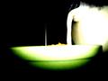
the white waterfall
by name_your_hippie_Van

Comment by fotodude:
the green tone on the bottom of the bowl is a distracting contrast to the rest of the color tones.....
the white spike that parriles the milks flow is also a distracting pice in this image......

the contrasty highkey affect is very poorly created in this image...the contrast should be brought to a normal level and the color tones worked out then this could have some sort of composition and photo like qoulity to it..........

as it is IMO it is just way to blown out in the subject area and way to dark evey where else.....its just not very good as is.
the white waterfall
08/24/2005 12:16:40 AM
the white waterfall
by name_your_hippie_Van

Comment by Jutilda:
The green area is too blown out and blurred to really make any sense. The idea is smart. Maybe work on focus a bit to make it really work.
Pages:  
Showing 11 - 20 of ~20


Home - Challenges - Community - League - Photos - Cameras - Lenses - Learn - Help - Terms of Use - Privacy - Top ^
DPChallenge, and website content and design, Copyright © 2001-2025 Challenging Technologies, LLC.
All digital photo copyrights belong to the photographers and may not be used without permission.
Current Server Time: 08/04/2025 03:56:10 PM EDT.