| Image |
Comment |
| 09/26/2005 09:15:27 PM |
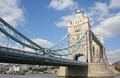
Tower Bridgeby bob_bobskiComment by sabphoto: Fits challenge=5
Color/lighting=0
DOF/focus=1
Wow factor/uniqueness=0
Attractiveness=1
Nice image, love the subject. Colors seem a little too bright. |
 Photographer found comment helpful. Photographer found comment helpful. |
| 09/26/2005 06:53:26 PM |
Tower Bridgeby bob_bobskiComment by xodiak: If you could have used a polarizer (and gotten good polarization) on the sky, this would have been a very nice shot. Ahh London in the Fall. |
| Photographer found comment helpful. |
| 09/23/2005 10:00:01 AM |
|
| Photographer found comment helpful. |
| 09/22/2005 09:00:29 AM |
Tower Bridgeby bob_bobskiComment by Tammer: This would make a nice postcard. The sky is terrific and the colors just right. Falls well into thirds. |
| Photographer found comment helpful. |
| 09/21/2005 08:38:05 PM |
|
| Photographer found comment helpful. |
| 09/21/2005 07:39:23 PM |
Tower Bridgeby bob_bobskiComment by Tom: This is the same bridge from dprievew.com for the Canon Digital Rebel XT tutorial. :-P |
| Photographer found comment helpful. |
| 09/18/2005 01:39:08 PM |
Branch Line Trainby bob_bobskiComment by strangeghost: Greetings from the Critique Club
by strangeghost
Hi Bob, welcome to DPC!
COMPOSITION
I like the composition. You're close in on your subject, the frame is filled, and you have great lines running diagonally through the frame with a dramatic perspective expansion toward the right. I might have cropped off the cables visible at the bottom. I'm sure your choice of subject left some voters saying "huh" as far as the challenge was concerned.
TECHNIQUE
I see several problems here, which if rectified, would have made this a much more eye-catching image. The whites of the train the stones at lower left are overexposed and have lost much detail. The colors in general seem a bit washed out and low contrast. Since you were already at f36 (!) you might have gone to a slightly faster shutter or even thrown a ND or CP filter on the lens to knock down the light a little more. The colors seem muted and pastel. I would have worked to bump the saturation of these colors and might also have shifted the hue a little to really make them pop. Also applying a curves "S" will help with the contrast and the tones. Finally, maybe a dramatic USM adjustment with 40/100/3 type settings. This doesn't really sharpen in the traditional sense but helps boost the tones.
OVERALL IMPACT
This is an image that had significant potential but suffered from some technical shortcomings that prevented it from standing out in a large, crowded challenge. You have a great eye for composition though. Keep shooting and keep experimenting with the longer exposure stuff, and don't be afraid to really work your images over in post-processing to bring out the potential.
I enjoyed studying your image for this critique. Message edited by author 2005-09-18 13:41:25. |
| Photographer found comment helpful. |
| 09/17/2005 04:17:11 PM |
|
| Photographer found comment helpful. |
| 09/16/2005 01:35:49 AM |
|
| Photographer found comment helpful. |
| 09/12/2005 08:25:22 PM |
|
| Photographer found comment helpful. |
Home -
Challenges -
Community -
League -
Photos -
Cameras -
Lenses -
Learn -
Help -
Terms of Use -
Privacy -
Top ^
DPChallenge, and website content and design, Copyright © 2001-2026 Challenging Technologies, LLC.
All digital photo copyrights belong to the photographers and may not be used without permission.
Current Server Time: 05/10/2026 05:47:47 AM EDT.