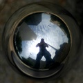
looking down at a 1in Steel ball up to a 667ft Steel towerby
nemesise1977Comment by Louis: Greetings from the Critique Club!
Although it may not be to everyone's taste, I personally very much like your interpretation of this challenge, and I think the overall idea is very clever. I like the almost "compass" approach to the elements being reflected: there are two opposing tall structures, and two opposing light fixtures, all surrounded by shorter buildings which give this a nice structure. The central figure - you - is also a nice balancing element. However, there are a few items that detract somewhat from the overall effect.
This appears at first glance to be a macro shot. The success of a macro depends, in my opinion, on the clarity of the subject, and unfortunately not much is very clear or sharp in your photograph. Whereas I can accept the blurry, almost muddied background surrounding the sphere, which actually could help to enhance the subject, the reflection itself is simply too out of focus or "not sharp" to have the high impact I'm certain you foresaw while composing this shot. You may have been able to mitigate this in post-processing, but it appears that wasn't done. Also at issue is the colour. Some more processing of the blue in this image may have helped to really make the sky pop, which would have given us a very clear area of interest, and would have enhanced the outlines of the structures being reflected.
Perhaps a matter of taste, but I personally struggle with the "photographer as subject" kind of image, where the literal act of taking the photograph is an integral or unavoidable element. This kind of photograph has to be really engaging to be able to pull such a picture off, which otherwise comes off as a tad clichéd. I think you've almost managed it compositionally here, but the aforementioned items take away, in my opinion, from the effect.
Finally, for an architectural challenge, architecture is not the most relevant part of this image, in my opinion. Other ideas are at work here, and the structures take a back seat to them. This is not in itself a bad thing, but it may have affected the way people viewed your image.
Overall though, a great idea, well thought out.