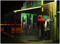
DPChallenge: A Digital Photography Contest You are not logged in. (log in or register
 
Browse Settings
Currently viewing:
Registered Usermpeters

Show comments:

Per page:

Order:

Comments:


Comments Received by mpeters
Pages:   ... [444] [445] [446] [447] [448] [449] [450] ... [475]
Showing 4461 - 4470 of ~4745
Image Comment
Traffic Light Spectrum
01/18/2006 11:41:46 PM
Traffic Light Spectrum
by mpeters

Comment by wavelength:
::Greetings from the Critique Club::

Such a hard photo to critique, mark.

Can I really find anything wrong with the Composition? Not really, interesing depth of detail and many different elements to gawk at. Lots of detail and interesting colors and constrast. The textures on the wall and ground, the interplay of the light....

But then, maybe what this challenge called for was a certain kind of simplicity. A clear and definite message or subject that jumps up and grabs you by the ears and says, "look right there moron!" I don't know, If you look through the top 30, this is mostly what you do see though. You have so much depth of detail in this image that some of the lesser elements compete for attention. While most of the time I would like that, maybe not for this challenge.

Another issue might be the high contrast. I looked at this on a few different monitors that are here at work. One SuperbrightNEC, one that is always too dark, and one that is middle-ish. The orders of magnitude in sharpness and detail are much different on all three. The one that is too dark gave the subject focus that I was talking about before, suggesting that maybe even more burning, or possibly a shorter shutter would have been apropriate.

Overall I really like this image though and think that it should have been given a more fair judgement. However, speedvoting, and badly calibrated monitors do not do this image justice.
Photographer found comment helpful.
Summer Treat
01/18/2006 11:24:08 PM
Summer Treat
by mpeters

Comment by MattO:
Greetings from the Critique club. After spending some time looking at the challenge entry. I am brought to a few thoughts I am going to put forward for you. I love the colors of this entry. The purple and green go really well together. It has wonderful composition and the border works really well. Nicely done.

I do have concerns that in reference to the challenge, they appear to be drinks, although by reading the description I'm sure they can be either/or, or both. The photo seems overexposed/blown out in areas. Making the glass stems disappear at some points and all together in others. The shallow DOF with the focus on the front straw takes away a bit. Perhaps the same shot done at f9 or so, would have made more focus then added gaussian blur to make the effect that you want. I think you actually scored real well for the challenge and a pretty nice finish. Well done.
Photographer found comment helpful.
Reflecting on Winter
01/18/2006 11:07:24 PM
Reflecting on Winter
by mpeters

Comment by swm4lfe_2001:
Very cool, great job.
Photographer found comment helpful.
Handicapping the Ponies
01/18/2006 07:51:59 PM
Handicapping the Ponies
by mpeters

Comment by rayg544:
This is exactly what this challenge is all about! Great use of DOF. A rock solid entry! 10
Photographer found comment helpful.
Handicapping the Ponies
01/18/2006 05:10:45 PM
Handicapping the Ponies
by mpeters

Comment by agenkin:
I really like how the people are situated in this shot. The eye jumps in an unusual zig-zag trajectory. I wish there was less DOF to isolate the guy in the right a little better.
Photographer found comment helpful.
Old Highway Four
01/18/2006 04:32:04 PM
Old Highway Four
by mpeters

Comment by agenkin:
Good subject, title, and composition.
Photographer found comment helpful.
Old Highway Four
01/18/2006 02:00:12 PM
Photographer found comment helpful.
Handicapping the Ponies
01/18/2006 01:36:52 PM
Handicapping the Ponies
by mpeters

Comment by elemess:
great minimalist approach. I might have liked to have more room on the left for balance; I like you gave your subject space.
Photographer found comment helpful.
DPC1919-3.jpg
01/18/2006 09:26:11 AM
DPC1919-3.jpg
by mpeters

Comment by HCvE:
cool
Photographer found comment helpful.
DPC1919-3.jpg
01/18/2006 09:24:51 AM
DPC1919-3.jpg
by mpeters

Comment by dahkota:
really like this. color tones very good, composition excellent. If I did anything at all, I would clone out the taller grass on the top left. It stops the 'roll' down the hill. Beautiful image anyway...
Photographer found comment helpful.
Pages:   ... [444] [445] [446] [447] [448] [449] [450] ... [475]
Showing 4461 - 4470 of ~4745


Home - Challenges - Community - League - Photos - Cameras - Lenses - Learn - Help - Terms of Use - Privacy - Top ^
DPChallenge, and website content and design, Copyright © 2001-2025 Challenging Technologies, LLC.
All digital photo copyrights belong to the photographers and may not be used without permission.
Current Server Time: 06/22/2025 12:38:54 AM EDT.