| Image |
Comment |
| 11/28/2007 04:35:15 PM |
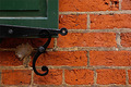
Shutter and Brickby iamkmaniamComment by Tlemetry: I love what you were going for here. Old bricks have great texture! I also love the swirl of the shutter holder. The wad of mortar is a major distraction to the image. Also the bricks appear orange here not the red that one would expect. I imagine you are getting a lot of comments to that effect.
This has great potential. |
 Photographer found comment helpful. Photographer found comment helpful. |
| 11/28/2007 11:18:36 AM |
|
| 11/28/2007 12:24:52 AM |
|
| 11/13/2007 11:08:44 AM |
|
| 11/11/2007 08:16:59 AM |
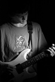
Coo Coo for Rock and Rollby iamkmaniamComment by spencerwood: Could have done with the hot spot of the light either on the body of the guitar or on the face. Its currently lighting up somewhere inbetween which is not the point of interest. Nice tones though |
| 11/10/2007 07:36:23 PM |
|
| 11/08/2007 12:23:34 PM |
Coo Coo for Rock and Rollby iamkmaniamComment by HeiSch: only one comment to the well executed low key pic: don't ket the kid pick what they want to wear during shooting. the little figure on the t-shirt takes away from the pic. It is a focal point for the viewer. |
| Photographer found comment helpful. |
| 04/26/2006 07:40:18 PM |
Old Lightby iamkmaniamComment by DrAchoo: The good:
1) The composition uses the rule of thirds nicely.
2) The lighting does create texture and interesting shadow
To be worked on:
1) The subject doesn't capture us at all. We look at it a second and then move on. You don't even have to add a new subject, but just more interest. An example would be the same shot, but you were lucky and had a creeping ivy vine crawling up the wall. It would give us more to digest.
2) While the lighting does create texture, it's a bit dark as well. More light and then more contrast would be beneficial. |
| 04/24/2006 12:21:17 PM |
|
| Photographer found comment helpful. |
| 04/19/2006 01:28:16 PM |
|
| Photographer found comment helpful. |
Home -
Challenges -
Community -
League -
Photos -
Cameras -
Lenses -
Learn -
Help -
Terms of Use -
Privacy -
Top ^
DPChallenge, and website content and design, Copyright © 2001-2026 Challenging Technologies, LLC.
All digital photo copyrights belong to the photographers and may not be used without permission.
Current Server Time: 06/10/2026 11:41:35 PM EDT.