| Image |
Comment |
| 10/09/2005 08:12:27 AM |
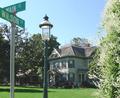
Main & Wilsonby zapgrafxComment by blemt: Really good idea here. Coupld of things- the streetlight and street signs are clashing for dominence. Both together clutter up the composition. I'd try shooting from the other side of the street sign and crop out the street light. Ignoring the light for a moment, the bushes and street sign make for an interesting frame. The other issue here is the light. Shot midday, the light is harsh and flattens out the scene. Try reshooting earlier or later in the day. |
 Photographer found comment helpful. Photographer found comment helpful. |
| 10/06/2005 06:12:10 PM |
|
| Photographer found comment helpful. |
| 10/06/2005 04:49:17 PM |
Fashion Trendsby zapgrafxComment by blondmcfly: I loved the etching on your glass, it's what made the pic stand out for me-gave it a real sense of originality in a sea of martinis and cosmos. The colors really compliment each other as well. I really thought you would place higher. |
| Photographer found comment helpful. |
| 10/06/2005 02:19:01 PM |
|
| Photographer found comment helpful. |
| 10/05/2005 02:34:52 PM |
|
| Photographer found comment helpful. |
| 10/05/2005 12:18:32 AM |
|
| Photographer found comment helpful. |
| 10/04/2005 10:33:08 PM |
Main & Wilsonby zapgrafxComment by drydoc: Love this scene (and the house). Right on the nose for the challenge. My only comment is that the image is somewhat over exposed. Polarizer mugt have added to the saturation. BOL 6 |
| Photographer found comment helpful. |
| 10/04/2005 01:08:51 PM |
|
| Photographer found comment helpful. |
| 10/04/2005 11:41:29 AM |
|
| Photographer found comment helpful. |
| 10/04/2005 09:46:07 AM |
Main & Wilsonby zapgrafxComment by bcoble: It appears that the image is alittle over exposed (too me). I like the house, not real sure about the sign and the pole though. |
| Photographer found comment helpful. |
Home -
Challenges -
Community -
League -
Photos -
Cameras -
Lenses -
Learn -
Help -
Terms of Use -
Privacy -
Top ^
DPChallenge, and website content and design, Copyright © 2001-2026 Challenging Technologies, LLC.
All digital photo copyrights belong to the photographers and may not be used without permission.
Current Server Time: 07/16/2026 09:41:05 AM EDT.