| Image |
Comment |
| 11/01/2006 09:38:38 AM |
|
 Photographer found comment helpful. Photographer found comment helpful. |
| 09/07/2006 11:45:13 PM |
|
| Photographer found comment helpful. |
| 09/07/2006 10:13:34 PM |
|
| Photographer found comment helpful. |
| 09/07/2006 01:22:21 PM |
XIby bragurComment by mpreslar: It is unclear what this is and why it should be interesting. |
| Photographer found comment helpful. |
| 09/06/2006 09:53:39 PM |
XIby bragurComment by Tranquil: Awesome colors and surreal shot. I could see a print of this hanging in a gallery. |
| Photographer found comment helpful. |
| 09/06/2006 09:17:32 PM |
|
| Photographer found comment helpful. |
| 09/06/2006 11:27:22 AM |
XIby bragurComment by posthumous: love the title. fascinated by the disorienting composition. 9 |
| Photographer found comment helpful. |
| 09/05/2006 10:29:16 AM |
XIby bragurComment by docurrie: I know I'm missing something that everyone else is getting with this shot. Can't seem to figure out what the subject is suppose to be, then numerals or the chains? |
| Photographer found comment helpful. |
| 09/05/2006 05:13:34 AM |
XIby bragurComment by jdannels: stellar color and composition, and I like the title to even pull your attention off the photo. I also like the lines of the chains lead the eye to the numbers. I wouldn't change a thing. 10 |
| Photographer found comment helpful. |
| 09/04/2006 11:40:45 PM |
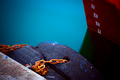
XIby bragurComment by CNovack: Oh ho-ho-ho! Love the visual impact of this and how well it plays into the current challenge title of (Free Study) XII. The mark on the ship shows XII just above the water line which matches the Free Study. Also the title of the piece is XI, which tells us what we don't see - we see from the Mark lines that the next one down from XII will be XI. I love how you are playing with the visual here and tying it to the challenge title. However, I think the composition needs a little improving to strengthen your presentation. First off, I love the hues of the blue of the water and the red of the ship. I really think you could make those two elements the main focus of your photo. Those colors could really make the photo visually 'pop' but as it is here they are lost in the composition. The red of the ship (and those white mark numbers) occupy only 20% of the composition. A tighter crop or even a square crop would make the water color and the ship the main stars of the composition. As an added bonus, calling more attention to the mark numbers will only strengthen the visual appeal of the image. Leaving in the weatherbeaten wood of the dock does not add visual appeal. Actually it detracts because it adds nothing to the composition overall & the worn color does not complement the bolder hues seen here. Even if you did not want to do that quite of a tight crop, cropping out a third on the left side will still leave a strong visual appeal. Plus, it would add just one other element of interest with the tires and the colorful orange chains. |
| Photographer found comment helpful. |
Home -
Challenges -
Community -
League -
Photos -
Cameras -
Lenses -
Learn -
Help -
Terms of Use -
Privacy -
Top ^
DPChallenge, and website content and design, Copyright © 2001-2026 Challenging Technologies, LLC.
All digital photo copyrights belong to the photographers and may not be used without permission.
Current Server Time: 07/16/2026 01:08:12 AM EDT.