| Image |
Comment |
| 04/29/2003 10:04:55 PM |
|
 Photographer found comment helpful. Photographer found comment helpful. |
| 04/29/2003 01:44:25 PM |
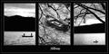
Stillnessby NatashaComment by lizardbeth: I love this. The black and white shots look perfect to me. The only reason I'm not giving you a 10 is because the middle shot doesn't evoke stillness to me. For some reason I'm seeing choppy waters and a boat that lost it's crew. |
| Photographer found comment helpful. |
| 04/29/2003 12:12:23 PM |
Stillnessby NatashaComment by Paige: I like your presentation. Nice photos that would stand out on their own individually too. To me the water motion does not represent "stillness", but that's just me. |
| Photographer found comment helpful. |
| 04/29/2003 11:27:27 AM |
Stillnessby NatashaComment by bamaster: Nice silhouettes. I like the monochrome... did you try it with different duotones? Remonds me of a poster... almost Ansel Adams like. |
| Photographer found comment helpful. |
| 04/28/2003 08:29:16 PM |
Stillnessby NatashaComment by karmat: I love the solitude this portrays, and the bw makes it particularly effective. If you put it on DPCPrints, please PM me and let me know. This is awesome!!!! |
| Photographer found comment helpful. |
| 04/28/2003 12:41:01 PM |
|
| Photographer found comment helpful. |
| 04/28/2003 12:35:37 PM |
Stillnessby NatashaComment by dsidwell: Makes me want to go out on a boat, that's for sure. Wonderful tones and lighting here. I kind of wish the 1st and 3rd panels provided more diverse points of view on this subject. |
| Photographer found comment helpful. |
| 04/28/2003 11:16:04 AM |
Stillnessby NatashaComment by justine: Hum, yah, this is really nice work. I like this a lot. Good everything. This is mighty fine! |
| Photographer found comment helpful. |
| 04/28/2003 11:09:30 AM |
Stillnessby NatashaComment by whitetiger: Nice composition. The middle and right photos are very nice, but the one on the left seems like it's missing something. The branches add a nice detail. |
| Photographer found comment helpful. |
| 04/28/2003 10:13:24 AM |
Stillnessby NatashaComment by ursula: Pretty good. The composition might be better if there were no outside white edge (around everything), that is, just a big black border. The letters need to be much bolder, possibly off-centre? |
| Photographer found comment helpful. |
Home -
Challenges -
Community -
League -
Photos -
Cameras -
Lenses -
Learn -
Help -
Terms of Use -
Privacy -
Top ^
DPChallenge, and website content and design, Copyright © 2001-2026 Challenging Technologies, LLC.
All digital photo copyrights belong to the photographers and may not be used without permission.
Current Server Time: 07/17/2026 12:25:41 PM EDT.