| Image |
Comment |
| 01/28/2003 04:48:58 PM |
|
| 01/28/2003 04:14:01 PM |
|
| 01/28/2003 05:38:49 AM |
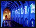
The Sanctuary by RackatComment by Antithesis: Awesome color tone. You probably don't want to hear this but lose the dude on the lower left and it's almost perfect. The other thing would be to have it perfectly vertical on the sides, noticibly the left side. Try using Skew in PS or something similar, and since this challenge is open you could've edited out the dude too. |
| 01/28/2003 01:42:32 AM |
The Sanctuaryby RackatComment by saikat: I love the blue tint to the structure and the contrasting pale orangish light on the distant wall. The clarity in the picture is remarkable! Is this place in the US? |
| 01/27/2003 11:20:46 PM |
|
| 01/27/2003 10:01:13 PM |
|
| 01/27/2003 09:39:09 PM |
|
| 01/27/2003 07:25:38 PM |
|
| 01/27/2003 04:38:51 PM |
|
| 01/27/2003 03:57:28 PM |
The Sanctuaryby RackatComment by crabappl3: Well done, very nice shot. The bright spot on the alter is a bit over powering, but doesn't lessen the score any. This is a 10 all the way! |
Home -
Challenges -
Community -
League -
Photos -
Cameras -
Lenses -
Learn -
Help -
Terms of Use -
Privacy -
Top ^
DPChallenge, and website content and design, Copyright © 2001-2026 Challenging Technologies, LLC.
All digital photo copyrights belong to the photographers and may not be used without permission.
Current Server Time: 06/09/2026 11:13:52 PM EDT.