| Image |
Comment |
| 09/05/2006 10:03:07 PM |
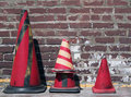
Abstract Conesby renegade1966Comment by klstover: I really love the contrast and colors and composition. The only thing that's a bit weird is the shape of the shadow on the center cone. Other than that I think this is perfect! |
 Photographer found comment helpful. Photographer found comment helpful. |
| 09/05/2006 10:02:11 PM |
|
| Photographer found comment helpful. |
| 09/05/2006 10:01:14 PM |
Abstract Conesby renegade1966Comment by posthumous: I love how the cones line up so perfectly. I'm not crazy about the harsh shadow cast by two of them (but not the third, mysteriously). Maybe you're not a fan of post-processing, but I would like to see this with higher contrast, or simply an "auto levels" in Photoshop. As for taking the photo, I'd consider getting even lower for a perfectly straight on view of the cones, waiting for the sun to go behind a cloud, or lining up the shot so the shadows are directly behind the cones. The appeal of this shot is in its flatness.
But before you listen to me, realize that I am a lover of the visual arts and a specialist in confusing DPC voters. |
| Photographer found comment helpful. |
| 09/05/2006 09:54:18 PM |
|
| Photographer found comment helpful. |
| 09/05/2006 09:53:08 PM |
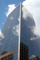
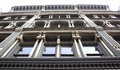
IMG_3565.JPGby renegade1966Comment by Katmystiry: Love the reflections in the glass! I think I'd try to clone out those brown windows. I've tried it before and it's really not too hard to do. |
| Photographer found comment helpful. |
| 09/05/2006 09:51:10 PM |
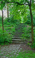
Stairs to where?by renegade1966Comment by Katmystiry: This looks really familiar ;) I'd crop off the left a bit to get rid of that white sky and do some burning on the stairs and cobblestones to give it some depth. Try playing with a dragonizer filter (for PS, not sure what you use to edit) to show you the differences burning and dodging can make. |
| Photographer found comment helpful. |
| 09/05/2006 09:48:59 PM |
|
| Photographer found comment helpful. |
| 09/05/2006 09:48:11 PM |
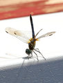
IMG_1900.JPGby renegade1966Comment by Katmystiry: Really nice capture of the position of the dragonfly. The bright white background is distracting from the colors of the dragonfly. |
| Photographer found comment helpful. |
| 09/05/2006 09:47:05 PM |
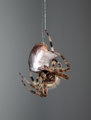
Time To Eatby renegade1966Comment by Katmystiry: This is an awesome capture! the background really helps make the spider stand out. Details on the web around the prey are amazing. |
| Photographer found comment helpful. |
| 08/26/2006 01:40:15 AM |
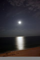
Moon Reflection.jpgby renegade1966Comment by jpochard: I have a photo very much like this one. Nice reflection, but I think the composition would benefit from cropping out the foreground beach all together and then leveling the horizon. |
| Photographer found comment helpful. |
Home -
Challenges -
Community -
League -
Photos -
Cameras -
Lenses -
Learn -
Help -
Terms of Use -
Privacy -
Top ^
DPChallenge, and website content and design, Copyright © 2001-2026 Challenging Technologies, LLC.
All digital photo copyrights belong to the photographers and may not be used without permission.
Current Server Time: 07/16/2026 03:48:41 PM EDT.