| Image |
Comment |
| 09/21/2005 03:02:39 PM |
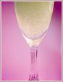
Pretty in Pinkby trobergeComment by Elaine: I think this would have looked better had the background been darker (like the upper right corner) so there would have been more contrast. |
 Photographer found comment helpful. Photographer found comment helpful. |
| 09/21/2005 11:42:10 AM |
Pretty in Pinkby trobergeComment by blondmcfly: I really like your pink back ground. Wondering if you could have gotten more of the glass in-prob not if you wanted to show the bubbles off? |
| Photographer found comment helpful. |
| 09/18/2005 10:58:28 AM |
Innocenceby trobergeComment by armelle: The soft feel of this photo works well here with a newborn! I like the soft pinks as well but the blue blanket distracts a bit here...nice lighting by the way!
IMHO, I would try cropping out the left side near the elbow and the top side as well near the hair so it's all pink on pink :) nice photo |
| Photographer found comment helpful. |
| 09/16/2005 02:29:51 PM |
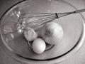
A Chefs Paintbrushby trobergeComment by Atropos: Nice shot. Nice and crisp and it was a good idea for the challenge it was entered into, I would have given it a 7. I just cant think of anything that you need an egg, garlic, and an onion for but I'm sure it would be good =] |
| Photographer found comment helpful. |
| 09/16/2005 11:32:41 AM |
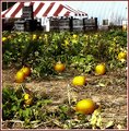
pumpkinpatch2b.jpgby trobergeComment by cheekymunky: I like the red strips with the green of the field, the tent on the right doesnt do anything for me so I might get rid of that. I'm not sure what processing has been done, but you've lost a lot of detail, oversharpening or noise reduction? resulting in Everything looks a bit smudged or plasticy. The colours are a bit off... but I kinda like it that way!
So I think you've a good eye, just have another crack at the processing. Hope it helps Message edited by author 2005-09-16 11:33:51. |
| Photographer found comment helpful. |
| 09/16/2005 11:29:14 AM |
pumpkinpatch2b.jpgby trobergeComment by davmct: i'm going to suggest the opposite of the others... i'm not really enthused about the pumpkins, their alien-glow isn't doing much for me. What I REALLY think stands out in this shot are the wooden crates in the background. I'd crop the top 1/3rd into its own shot.
The top 1/3rd has a nice subtle feel to it. The middle third is WAY too blurry and hurts my eyes (also, no detail, and unnatural colours). The bottom third has potential, but I think there is alot blown out here and the it looks like you neat-image'd them into a nubile enfancy (ie: their skin is a little TOO baby-soft). You've managed to blow out all of the detail which gives this picture "texture" and made it cold instead of the warmth one would imagine from pumpkins (and home-made pumpkin pie as their by-product).
keep the top 1/3rd, drop the rest.
|
| Photographer found comment helpful. |
| 09/16/2005 11:29:07 AM |
pumpkinpatch2b.jpgby trobergeComment by pawdrix: Like they said. There are some major coloring issues here and the sharpness or general clarity of the image needs to be worked on.
The image is also too busy for my eyes but that's your choice. |
| Photographer found comment helpful. |
| 09/16/2005 11:26:12 AM |
pumpkinpatch2b.jpgby trobergeComment by LeeD: I'm honestly not too crazy about it.
Compositionally I don't like the tent, crates, and building in the background. They make the overall image too busy IMHO. The image composition would be better if the building "stuffs" were cropped out.
The image itself appears overprocessed, smudgy, blurry, something I can't quite put my finger on. It's just simply not very clear. I like the glow on the individual pumpkins, but the lack of clarity detracts too much. Did you use NeatImage?
I would like to see the original. I think there may be something to work with here. I like the use of complimentary colors (green and yellow/orange) in the pumpkin patch and feel like there is much more potential in this image. |
| Photographer found comment helpful. |
| 09/16/2005 11:24:36 AM |
pumpkinpatch2b.jpgby trobergeComment by nomad469: Wow...this is way oversharpened and the colors are off.
that being said ... if you loose the top 1/3 of the image it takes on a kind of surreal look
The border color was a bad selection IMHO
|
| Photographer found comment helpful. |
| 09/16/2005 11:21:46 AM |
pumpkinpatch2b.jpgby trobergeComment by CalamitysMaster00: I believe the contrast is way to hight, it looks stressed out and takes away from the pic itself. However the picture is very good... have you thought of cutting out all the tents and just showing the pumpkins? |
| Photographer found comment helpful. |
Home -
Challenges -
Community -
League -
Photos -
Cameras -
Lenses -
Learn -
Help -
Terms of Use -
Privacy -
Top ^
DPChallenge, and website content and design, Copyright © 2001-2026 Challenging Technologies, LLC.
All digital photo copyrights belong to the photographers and may not be used without permission.
Current Server Time: 07/17/2026 12:02:18 AM EDT.