| Image |
Comment |
| 01/09/2006 07:57:33 AM |
|
 Photographer found comment helpful. Photographer found comment helpful. |
| 01/09/2006 01:19:06 AM |
|
| Photographer found comment helpful. |
| 01/09/2006 12:36:43 AM |
|
| Photographer found comment helpful. |
| 01/09/2006 12:31:48 AM |
|
| Photographer found comment helpful. |
| 01/08/2006 12:09:06 AM |
fallrose_filtered.jpgby trobergeComment by macrothing: Nice colors and color combinations. 'If only' the texture of the petals were as discernable as the leaves, make this even better in my opinion. I like the composition. |
| Photographer found comment helpful. |
| 01/08/2006 12:08:02 AM |
lizard2gothicglowcompentry.jpgby trobergeComment by macrothing: Difficult, but maybe a '6', not sure, hypothetically, re this is a 'Free Study IX Out-take'. I like the composition and pose, but again, seems just 'too' over processed. Obviously this was something you were going for. I think that the detail in the skin/texture 'naturally' would have been better, but just my opinion. Contrast seems a bit high too, making for a little too dark, especially at this size, but again, likely what you were aiming for. |
| Photographer found comment helpful. |
| 01/08/2006 12:03:55 AM |
Running Freeby trobergeComment by macrothing: I gave this a 7. I liked the composition but, criticism; the feet cropped was a fairly minor issue, but mainly it was the pp effects (looked like burning/dodging) that seemed a little 'too much' that it started to detract from the natural 'feel' of this, in my opinion. |
| Photographer found comment helpful. |
| 01/08/2006 12:01:12 AM |
Vintage Toy Store Catalog Coverby trobergeComment by macrothing: I gave this a 6. I thought it was good. The toning works well and I like the frame. Criticism; not much, maybe a variation in lighting, tryning to create a little more 'depth', may have made this even better in my opinion. Perhaps a fraction more detail too. |
| Photographer found comment helpful. |
| 01/07/2006 11:59:23 PM |
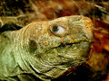
tortoisesfwsm.jpgby trobergeComment by macrothing: Good capture. Unusual, especially the .. bokeh(?), looks like it might be the body/shell. Never knew how 'human looking' their eyes were. Seems it may be a fraction blurred, but difficult to tell. The lighting, while shows up the texture and eye well, just seems a little 'harsh', or unnatural. Sorry, difficult to explain, but I tried. edit: just realized this was an 'out-take' as well.. hypothetically ..'6', maybe '7' for the issues stated above (pretend anyway, obviously). Message edited by author 2006-01-08 00:10:43. |
| Photographer found comment helpful. |
| 12/23/2005 02:28:17 AM |
|
| Photographer found comment helpful. |
Home -
Challenges -
Community -
League -
Photos -
Cameras -
Lenses -
Learn -
Help -
Terms of Use -
Privacy -
Top ^
DPChallenge, and website content and design, Copyright © 2001-2026 Challenging Technologies, LLC.
All digital photo copyrights belong to the photographers and may not be used without permission.
Current Server Time: 07/16/2026 06:03:53 PM EDT.