| Image |
Comment |
| 11/08/2005 10:27:22 PM |
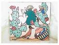
Busy Tileby painthorseComment by Prism: tile is busy all right. Sorry but your shot doesn't appeal to me. The lighting is flat and a straight on shot of the tile does not present it in a manner that provides visual interest. Perhaps a side shot with more indirect or natural lightling would have helped. |
| 11/08/2005 08:23:09 PM |
Busy Tileby painthorseComment by ggbudge: I'm sorry, but I don't think this was a good choice of subject. It's a tile and it's "busy", but there are many more interesting subjects in the world to photograph instead of someone's artwork. Good luck in future challenges and I hope you don't take this personally, but as the constructive critique as it was intended. feel free to pm me if you wish. 3 |
 Photographer found comment helpful. Photographer found comment helpful. |
| 11/08/2005 12:05:09 PM |
|
| 11/07/2005 08:54:35 AM |
Busy Tileby painthorseComment by garlic: I think you are not meeting the challenge in an original or creative way. Also find this image lacking deeper colorbalance and more sharpness. |
| 11/04/2005 02:08:05 PM |
Busy Tileby painthorseComment by Ivory: Perhaps if you had taken a wall with many of these tiles it would have met the challenge more appropriatly as it is, to me anyway, you have taken a picture of one tile with a lot going on in it. So to me this is a picture of a picture. The background blends in with it to much for my taste and there is no one point of interest. |
| Photographer found comment helpful. |
| 11/03/2005 10:53:37 AM |
Busy Tileby painthorseComment by Elaine: I guess this is legal since you show more than the tile, but to me it is just showing someone else's work. |
| 11/02/2005 11:33:06 PM |
Busy Tileby painthorseComment by rick13601: you must have been running out of time and/or ideas to take a picture of a tile and then submitting it. |
| 10/28/2005 08:53:00 PM |
|
| Photographer found comment helpful. |
| 10/27/2005 08:43:31 PM |
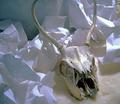
skull in lightby painthorseComment by Jammur: Meets the challenge, light skull on white background.
But, dark subject, very dark. Not a particularly attractive skull either. |
| Photographer found comment helpful. |
| 10/27/2005 05:38:57 PM |
skull in lightby painthorseComment by persimon: I think the crumpled up paper creates too much texture. It causes the light to do funny things I would have like to have seen the skull only on the faux fur background. 6 |
| Photographer found comment helpful. |
Home -
Challenges -
Community -
League -
Photos -
Cameras -
Lenses -
Learn -
Help -
Terms of Use -
Privacy -
Top ^
DPChallenge, and website content and design, Copyright © 2001-2026 Challenging Technologies, LLC.
All digital photo copyrights belong to the photographers and may not be used without permission.
Current Server Time: 07/17/2026 12:55:36 AM EDT.